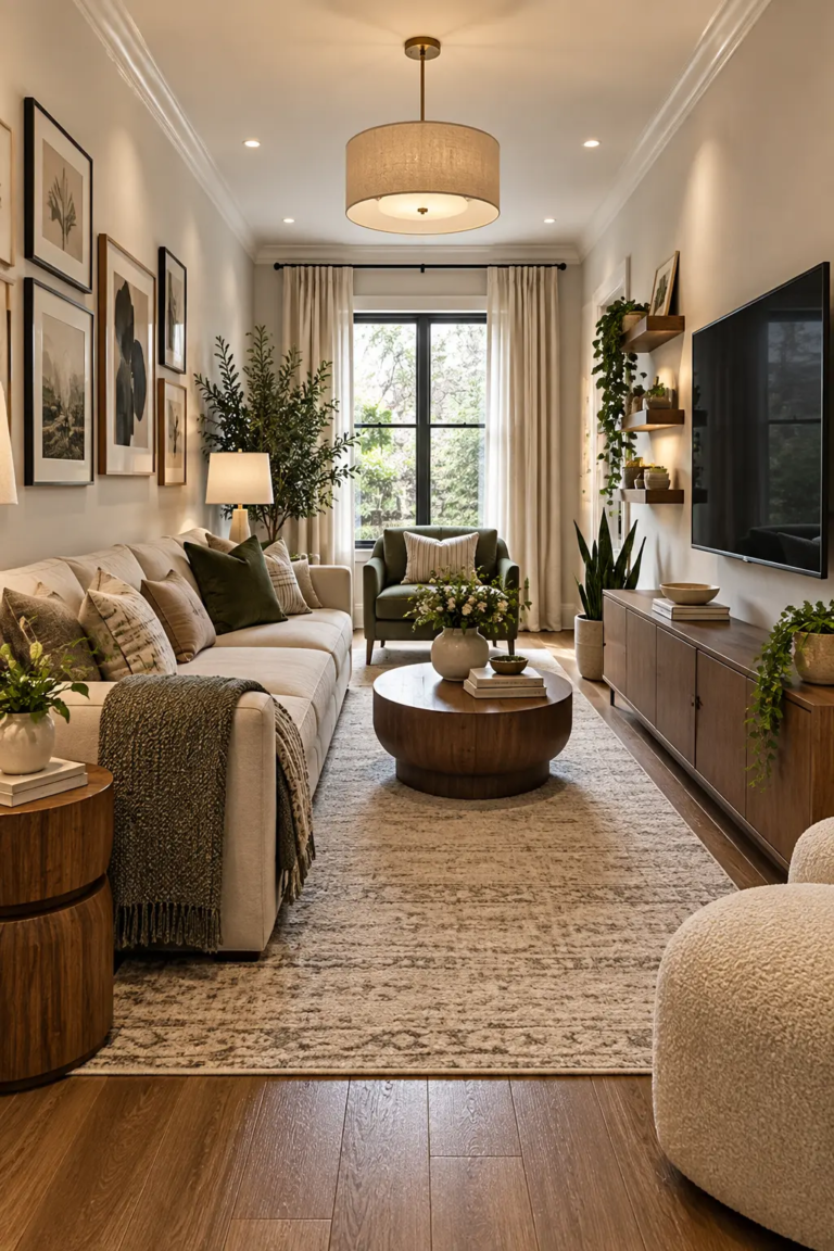
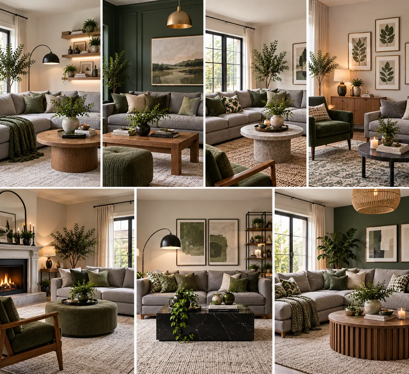
7 Grey and Green Living Room Ideas That Don’t Read Cold or Corporate
Grey and green sounds like an easy pairing on paper — one neutral, one nature-adjacent accent — and then you actually put it together and the room ends up feeling like a dentist’s waiting room instead of the calm, layered space you had in mind. That’s not a coincidence. Grey and green are two of the most undertone-sensitive colors in the palette, and when their undertones clash, the whole room reads flat and cold no matter how good the individual pieces are.
The fix isn’t a different color combination. It’s understanding why this particular pairing goes wrong so often, and building around that instead of around a mood board.
Why Grey and Green Fight Each Other More Than People Expect
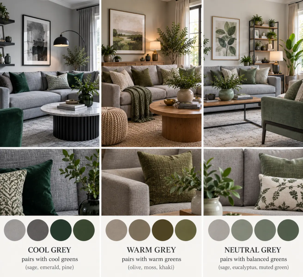
Every grey and every green has a hidden undertone — blue, purple, or green running through the grey, and blue, yellow, or grey running through the green. A cool, blue-based grey next to a cool, blue-based green (think slate grey with a sage that leans grey-blue) produces almost no visual warmth anywhere in the room, which is exactly the sterile effect people are trying to avoid. The rooms that feel rich instead of clinical almost always pair a warm grey — one with a beige or taupe undertone — against a green that leans yellow, like olive or moss, rather than a green that leans blue, like sage or eucalyptus.
[IMAGE: Paint swatch flat-lay comparing a warm greige next to olive green, and a cool blue-grey next to sage green, side by side for contrast]
Pro Tip: Test your grey and green together in a north-facing room before committing — north light is cooler and blue-toned by nature, and it will exaggerate any cool undertones in both colors far more than the warmer light in a south- or west-facing room.
Pick Your Grey’s Undertone First, Then Match the Green to It
Most people choose the green first because it’s the more exciting color, then hunt for a grey that “goes with it.” Reverse that order. Your grey — likely covering more square footage across walls, a large sofa, or flooring — sets the temperature for the whole room, so it should be the fixed point. Hold a few green fabric or paint samples against your actual grey in your actual room’s light, not under store lighting, and eliminate any green that looks muddy or makes the grey look dingier than it did alone.
Use Green as the Deep Anchor Color, Not the Small Accent
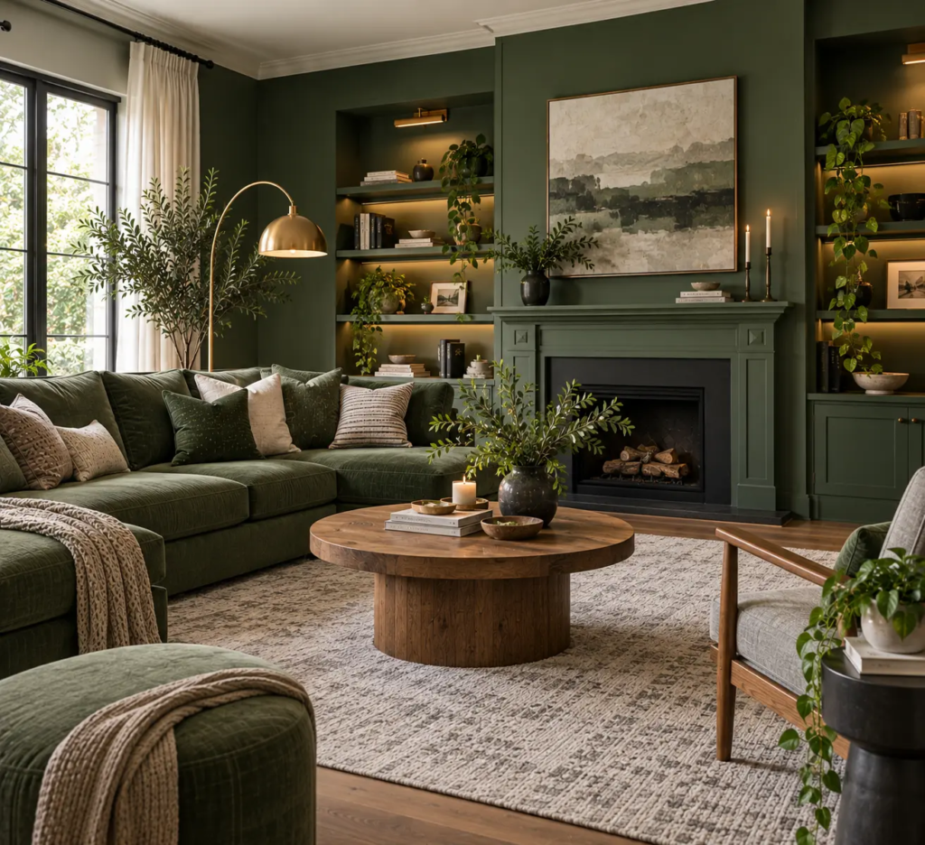
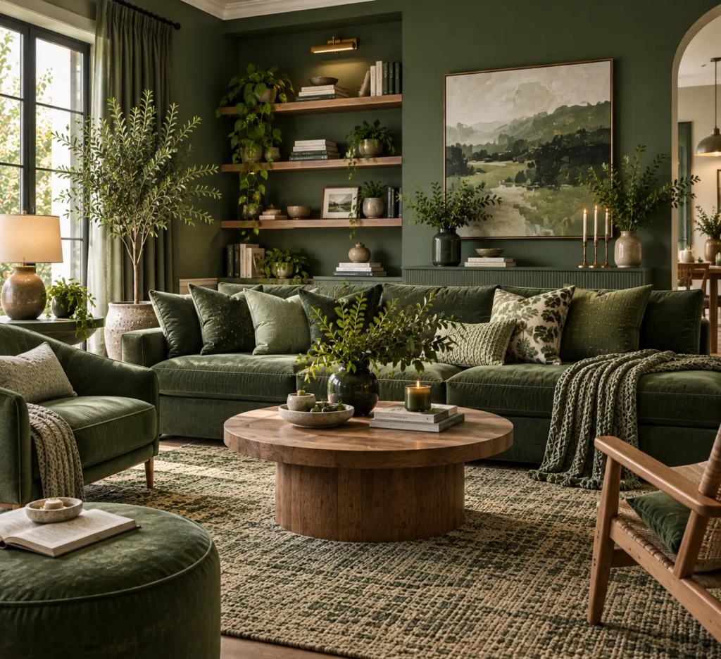
A single green throw pillow on a grey sofa is the most common — and weakest — version of this combination, because it treats green as decoration rather than structure. Green does more work as an anchor: a green sofa against warm grey walls, or a deep green accent wall behind a grey sectional. Anchoring the room with green rather than scattering it in small doses gives the pairing enough visual weight to feel deliberate instead of accidental.
Layer at Least Three Greens to Avoid a “Two-Tone” Look
A room with exactly one grey and one green reads as a paint-store display, not a lived-in space. Real depth comes from using two or three shades of green at different saturations — a deep olive sofa, a lighter sage pillow, and a still-lighter eucalyptus in a throw or artwork — the same way a monochrome room needs tonal range to avoid looking flat. Keep them all on the same side of the undertone spectrum you chose earlier; mixing a yellow-leaning olive with a blue-leaning sage undoes the harmony you just built.
Pro Tip: When layering multiple greens, put the darkest shade lowest in the room (rug or sofa) and the lightest highest (artwork or a shelf accent) — it mimics how green actually appears in nature, from deep undergrowth to pale new leaves, and reads as intentional rather than random.
Bring in Warm Wood and Brass to Counteract the Cool Pairing
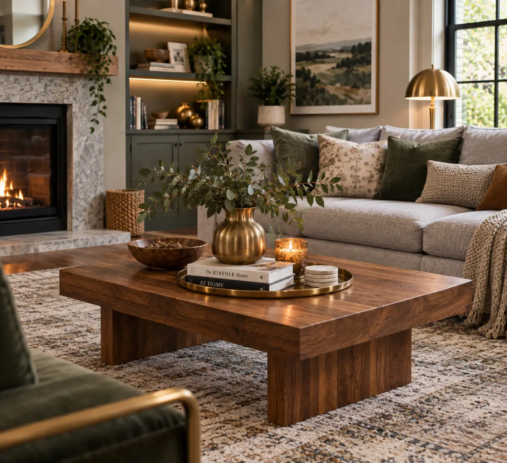
Even with a warm grey and a yellow-leaning green, the combination can still feel a little flat without a third material to break it up. Warm-toned wood — honey oak or walnut rather than grey-washed or whitewashed finishes — and brass or warm-brass-toned metal hardware both add the temperature contrast that grey and green alone can’t provide. This is where a lot of otherwise well-planned grey-and-green rooms lose their warmth: they get the fabric colors right and then finish the room in cool-toned black metal and light ash wood, which cancels out the work the color palette just did.
Let Textiles Carry the Texture Contrast
Because grey and green are both fairly muted, matte colors, a room built entirely from flat-finish paint and smooth cotton can end up looking two-dimensional even with the undertones matched correctly. Bring in texture through material rather than more color: a bouclé or velvet accent chair, a chunky wool throw, a woven jute or wool rug underneath. Velvet in particular is worth calling out here — its pile catches light differently depending on the angle, which gives a single green sofa more visual movement than the same shade in a flat linen ever would.

Use Plants as the Bridge Between Painted Green and Living Green
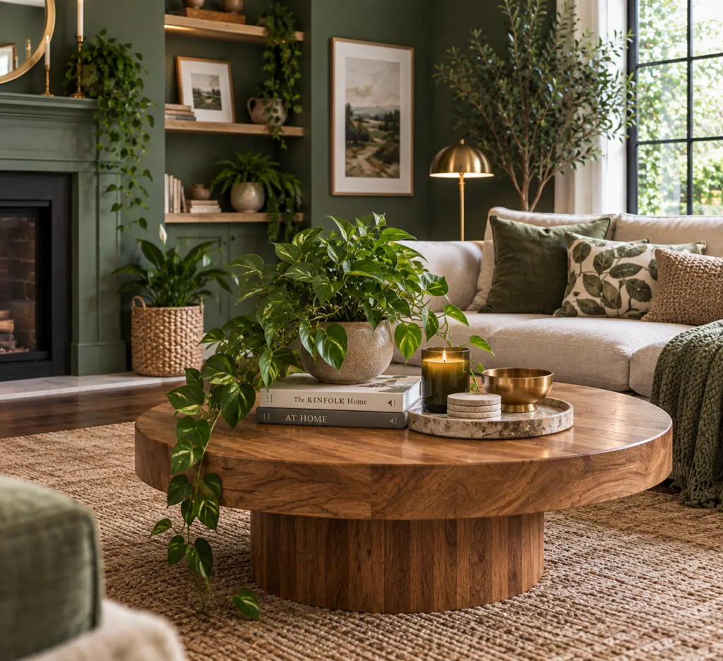
Real plants do something painted or upholstered green can’t: they connect the room’s designed color palette to something that’s actually alive, which keeps the whole scheme from feeling like a paint chip come to life. A few larger specimens — a fiddle-leaf fig, a rubber plant, a snake plant in a warm terracotta or stoneware pot — do more for the room than a dozen small ones scattered across shelves, because they read as intentional statement pieces rather than an afterthought.
Balance With a Warm Neutral Underfoot
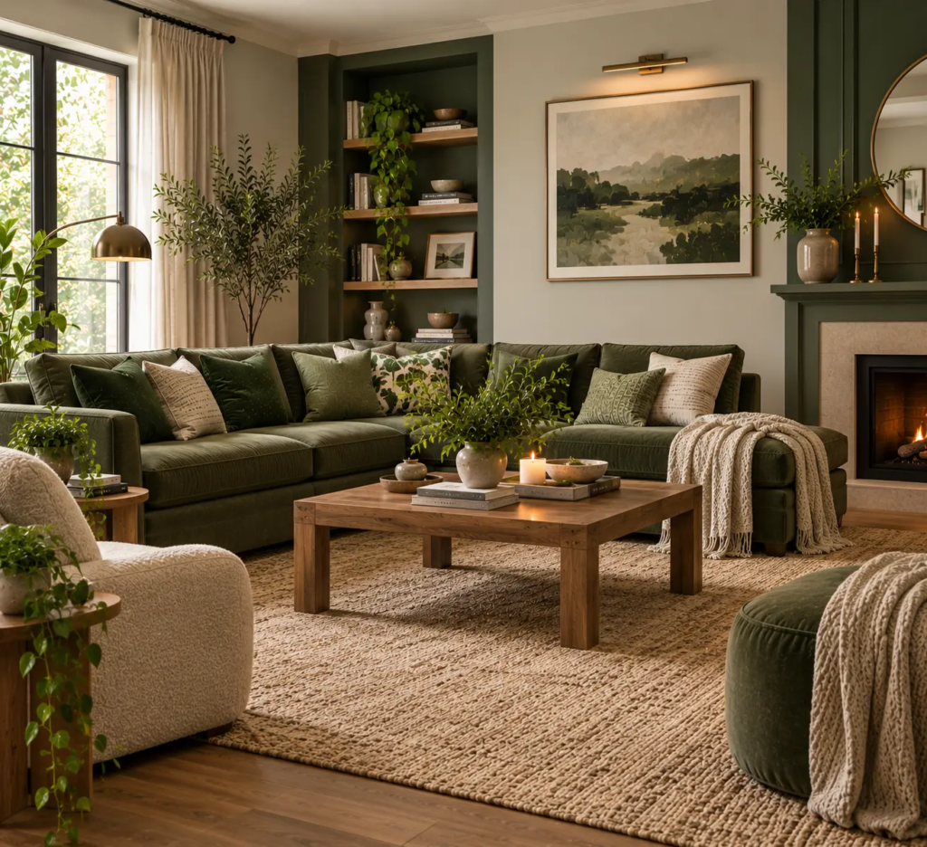
If your grey leans even slightly cool despite your best undertone matching, a warm neutral rug — camel, warm oatmeal, or a soft rust-brown — grounds the whole palette from below and keeps the room from tipping fully cold. This matters more in rooms with grey flooring or grey-toned hardwood, where you’re already starting with two cool elements (floor and walls) before you’ve added any furniture at all.
Common Mistakes to Avoid
The biggest one is mismatched undertones — pairing a cool grey with a warm green, or vice versa, which is the root cause of most grey-and-green rooms that feel “off” without an obvious reason why. A second mistake is going too dark across both colors at once: a deep charcoal grey with a deep forest green, with no lighter value anywhere in the room, can make even a large space feel closed in. Third, treating green purely as an accent color rather than giving it real presence somewhere in the room — a pillow here and there won’t carry the combination the way an anchor piece will.
Pro Tip: If your grey sofa or walls are already fixed and lean cool, don’t fight it with a warm olive green — go warmer within the green family using a golden-toned sage instead, which bridges the two temperatures better than a true olive would against a cool grey base.
[INTERNAL LINK: related post on living room aesthetic]
Budget-Friendly Grey and Green, at Any Price Point
On a lower budget (under $150), start with layering: a second and third shade of green through pillow covers and a throw, plus swapping any cool-white bulbs for warm 2700K ones, which will shift the whole room’s temperature more than you’d expect. At a mid budget ($150–$600), a properly sized area rug in a warm neutral or a large plant in a good pot delivers the most visible change for the money. At a higher budget ($600+), prioritize one anchor piece — a green sofa or a single accent wall in a warm, professionally color-matched paint — over several smaller green accessories, since one well-matched large piece does more for the room’s cohesion than five small ones ever will.
[IMAGE: Three-tier budget flat-lay — green pillow covers and a warm bulb, then a camel rug and large plant, then a green sofa swatch and paint chip]
[INTERNAL LINK: related post on elegant living room design]
FAQ
Does grey and green work in a small living room, or will it feel dark? It works well in small rooms as long as you keep your grey on the lighter end and reserve deeper greens for one anchor piece rather than the walls and furniture both. A pale warm grey wall with a single deep green sofa keeps the room feeling open, while two dark colors covering large surfaces at once will shrink a small space visually.
Is warm grey or cool grey better with green? Warm grey — anything with a beige, taupe, or greige undertone — pairs more easily with green because it echoes the warmth found in most greens, even cooler ones like sage. Cool, blue-based greys can still work, but they need a genuinely warm, yellow-leaning green like olive or moss to avoid the flat, sterile effect this combination is prone to.
What accent color goes with grey and green besides wood and brass? Terracotta and warm rust work well as a third accent, since they echo the warm undertone you’re already using to balance the palette, without introducing a fourth distinct hue. A small amount goes a long way — a terracotta pot or one rust-toned pillow is usually enough.
Can I do this combination without a green sofa? Yes — an accent wall, a large area rug, or heavy curtains in green can all serve as the anchor instead of the sofa, which is a useful workaround if you’re renting or not ready to commit to green upholstery. The key is picking one of those elements to carry the color at scale, rather than spreading it thinly across several small accessories.
Will grey and green go out of style quickly? Grey and green as a combination has held up longer than most trend-driven palettes because it echoes natural materials — stone and foliage — rather than a specific decade’s aesthetic. The more trend-sensitive choices within it are usually the exact shades (a very saturated emerald reads more “of the moment” than a muted sage or olive), so lean toward muted greens if you want the room to age well.
The Real Takeaway
Grey and green isn’t a difficult combination — it’s an undertone-sensitive one, and most rooms that feel off got the shades right but the temperatures wrong. Start by identifying whether your grey leans warm or cool, choose your greens to match that temperature rather than the mood board photo you liked, and add warmth back in through wood, brass, or a rug wherever the palette still feels flat.