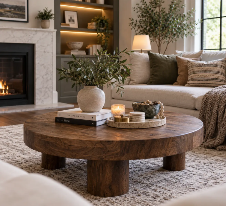
An open kitchen, dining, and living room combo solves one problem — sightlines, natural light, and the ability to cook while everyone else hangs out — and creates another one almost immediately: without walls to separate the three functions, it’s easy to end up with one big room where nothing feels intentional. The sofa, the dining table, and the kitchen island all just sort of… coexist, with no visual cue telling you where one activity ends and the next begins.
The fix isn’t adding walls back. It’s using the tools that actually define a zone in an open floor plan: rugs, lighting, furniture orientation, and a few deliberate material or color shifts. Every idea below tackles the same core problem — how to make a kitchen dining living room combo read as three distinct spaces you move through, rather than one undefined great room — using techniques that don’t require construction.
The Foundation: Zones Are Created by Layers, Not Lines
In a room with actual walls, the boundary between kitchen and living room is obvious — it’s the wall. In an open combo, that boundary has to be recreated using layered cues instead of a single hard line, and the most effective layouts stack at least two or three of these layers per zone rather than relying on just one.
The four layering tools are: flooring and rugs (a rug under the living area furniture, bare floor or a runner in the kitchen), lighting (different fixture types and heights per zone), furniture orientation (pieces angled to create a sense of enclosure even without walls), and color or material shifts (a different wall color, a change in cabinet or trim tone, or a distinct accent color per zone). No single layer does all the work — a rug alone under a sofa in an otherwise identical room won’t read as a separate “zone” nearly as clearly as a rug plus a change in lighting plus furniture that’s angled away from the kitchen.
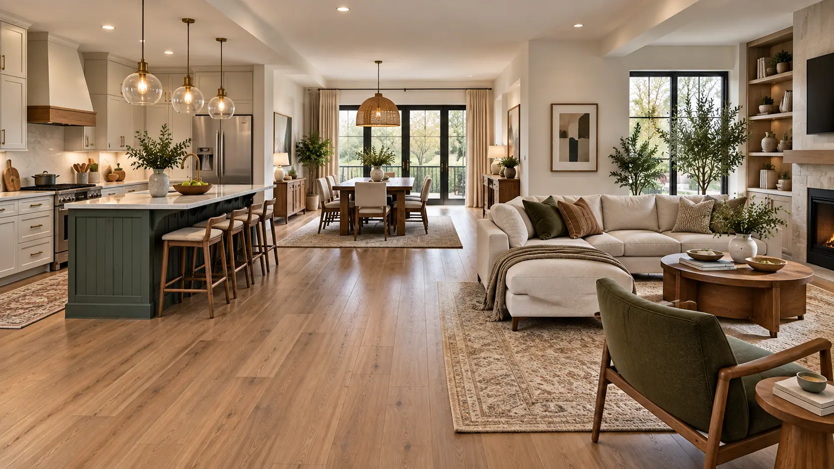
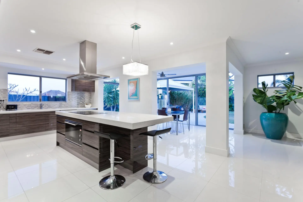
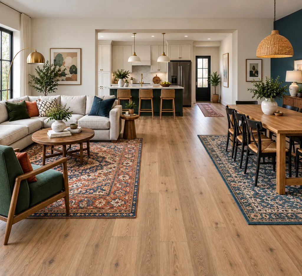
[IMAGE: An open-concept great room with a distinct rug anchoring a living area, pendant lights over a kitchen island, and a dining table lit by a lower-hanging fixture, all under one ceiling with no walls]
1. Anchor the Living Area with a Rug That Doesn’t Touch the Kitchen
The single most effective zoning tool in an open kitchen-dining-living combo is a rug sized to hold the entire seating group — sofa, chairs, and coffee table — with all furniture legs either fully on the rug or fully off it. A rug that only catches the front two legs of the sofa, with the back legs on bare floor, makes the seating area look unfinished rather than defined; sizing up so the whole grouping sits on the rug (typically an 8×10 or 9×12 for a standard sectional-and-chairs layout) does the opposite.
Keep the rug’s edge a reasonable distance from the kitchen’s hard flooring transition, ideally at least 3 to 4 feet of bare floor between the rug and any kitchen island or cabinetry. That buffer zone reads as a hallway between spaces, even though nothing is physically separating them.
Pro Tip: Choose a low-pile or flatweave rug for the section closest to the kitchen-adjacent walking path, even if the rest of the living area rug is plusher — high-pile rugs near a kitchen traffic zone trap crumbs and grease splatter in a way that’s much harder to clean than a flatweave.
In a combo layout, uniform overhead lighting across the entire ceiling is one of the fastest ways to flatten the sense of separate zones, because even well-placed furniture and rugs can’t fully overcome a single lighting temperature and height washing over the whole room. Instead, give each zone its own lighting logic: pendant lights or a linear fixture over the kitchen island at counter-height-plus-30-inches, a lower-hanging fixture or chandelier centered over the dining table (ideally 30–34 inches above the tabletop), and floor or table lamps at seated eye-level in the living area rather than relying on the same ceiling cans used elsewhere.
This also solves a functional problem beyond aesthetics: task lighting over the kitchen and dining table needs to be brighter and cooler for food prep and eating, while the living area generally works better with warmer, dimmable ambient light for relaxing — a single lighting scheme across all three zones forces a compromise that serves none of them well.
Related: [INTERNAL LINK: related post on open kitchen dining room ideas for a warm and functional home] for more on layering lighting specifically between a kitchen and adjoining dining space.
3. Use Furniture as a Soft Divider
A sofa with its back facing the kitchen, paired with a console table or a low bookshelf running along that same back edge, does the job a half-wall used to do — it gives the living area a defined “back” and creates a natural surface for lamps, décor, or a spot to set down a drink while standing near the kitchen. This works especially well in combo layouts where the living area sits between the kitchen and dining space, since the sofa back becomes the visual and physical boundary between “sit down” and “walk through.”
The height of that console matters: something between 30 and 36 inches keeps sightlines open across the room (important if you want to see the living area from the kitchen while cooking) while still reading as a clear boundary rather than just another surface floating in the middle of the floor.
Pro Tip: If your sofa back faces a walking path rather than the kitchen directly, add a narrow bench or a stack of low baskets behind it instead of a console — this stops people from bumping the sofa back as they pass through, which is one of the more common friction points in a shared kitchen-living traffic path.
4. Keep Flooring Consistent, Then Break It with Color
Running the same flooring material throughout a kitchen-dining-living combo (rather than switching materials at each zone boundary) is generally the better long-term choice — it makes the whole space feel larger and avoids awkward transition strips in the middle of a walking path. But consistent flooring means the zoning work has to happen elsewhere, usually through color: a distinct wall color or an accent wall in the living area, different cabinet or shelving tones in the kitchen, and a dining space that borrows elements from both to act as the visual bridge between them.
This is also where a shared accent color across all three zones — repeated in a throw pillow, a runner, and a set of dining chair cushions, for example — helps the room feel cohesive rather than like three unrelated spaces stitched together, even though each zone has its own identity otherwise.
For more on choosing an accent wall color that reads well from multiple angles in an open room, see [INTERNAL LINK: related post on living room wall color].
5. Plan the Traffic Path Before the Furniture
The layouts that feel most functional in a kitchen-dining-living combo are planned around a clear walking path first, with furniture placed around that path rather than the other way around. A minimum of 36 inches of clearance for a main walking path (and ideally 42–48 inches near the kitchen work zone, where people often carry dishes or hot pans) keeps the space usable even when all three zones are occupied at once.
The most common layout mistake here is positioning the dining table so it sits directly in the natural path between the kitchen and the living area — every trip from the fridge to the couch then requires walking around or through the dining set. Shifting the table slightly to one side, even by a foot or two, or positioning it perpendicular to the main path instead of blocking it, solves this without losing any dining capacity.
Matching every zone’s furniture and finishes too closely. A combo layout where the dining chairs, sofa fabric, and kitchen bar stools are all the same wood tone and the same neutral color can end up looking like one long, undifferentiated room rather than three connected spaces.
Lighting the whole room from one switch. If every fixture in the kitchen, dining, and living areas is on a single circuit with no separate dimming, you lose the ability to set a different mood or brightness for cooking versus relaxing, which undercuts a lot of the zoning work done elsewhere.
Ignoring sound and smell overlap. Without walls, kitchen noise (a running dishwasher, a loud range hood) and cooking smells travel freely into the living area. A capable range hood and a living area positioned with some distance from the stove, when the floor plan allows it, reduce this more than any amount of visual zoning can.
Oversizing the dining table for the space between zones. A table that’s too large for the gap between the kitchen and living area ends up eating into the walking path (see Idea 5) or crowding the seating area, which undoes the sense of three separate, comfortable zones.
Budget-Friendly Ways to Zone the Space
You don’t need a renovation to test whether stronger zoning improves how the room lives day to day:
Under $50: Rearranging existing furniture to create the sofa-back boundary in Idea 3, or adding a runner rug in the kitchen to visually separate it from the living area’s rug.
$100–$300: A properly sized area rug for the living zone, or a floor or table lamp added to the living area to reduce reliance on overhead kitchen-style lighting.
$300–$800: Swapping a single overhead fixture for zone-specific pendant lighting over the dining table or kitchen island, or an accent wall paint job behind the living area seating.
Pro Tip: Before buying a rug or rearranging furniture, mark out the proposed zone boundaries on the floor with painter’s tape and live with it for a few days — it’s a five-minute, zero-cost way to check that walking paths and furniture placement actually work before committing to a rug size or a furniture rearrangement you can’t easily return.
[IMAGE: A homeowner using blue painter’s tape on a wood floor to mark out a proposed living area rug boundary in an open-concept space, sofa and coffee table visible nearby]
Bringing It Together
A kitchen dining living room combo doesn’t need walls to feel like three distinct spaces — it needs layered cues that do the same job walls used to: a rug that holds the seating area, lighting that shifts in height and warmth from zone to zone, furniture angled to create a sense of enclosure, and a clear walking path planned before anything else gets placed. Start with whichever zone feels least defined right now, apply two or three of these layers to it, and you’ll likely find the rest of the room reorganizes itself around that anchor.
If you’ve searched for black and white dining room ideas and scrolled past a dozen photos that all look like the same glossy showroom — pristine, symmetrical, a little cold — you’re not imagining it. Black and white is one of the easiest color combinations to get technically “right” and one of the easiest to…
You can spend serious money on curtains and still end up with flat rectangles hanging beside the window. You can also spend modestly and get drapery that looks like it came from a workroom. The gap between the two is rarely fabric price. It comes down to how much cloth is gathered, where the rod…
The living room is often considered the heart of the home. It is where families gather, guests are entertained, and everyday moments turn into lasting memories. Because of this, choosing the right sofa is one of the most important decisions when designing a comfortable and attractive living room. Whether you prefer contemporary aesthetics, timeless elegance,…
Most living room table decor advice is written for a table nobody actually uses — a perfectly styled surface of stacked books, a single candle, and a small vase, photographed before anyone sets down a coffee mug or puts their feet up. The second real life hits that table, the styling falls apart: rings on…
A white couch can completely transform a living room, making the space feel brighter, cleaner, and more inviting. Its neutral color works beautifully with almost every decorating style, from minimalist and Scandinavian to modern, farmhouse, and cozy contemporary. Whether you have a large family room or a small apartment, a white sofa can become a…
You’ve seen the bathrooms on Pinterest — the fluted glass shelf, the linen shower curtain pooling just slightly on the floor, the single stem of eucalyptus in a stoneware vase. Then you look at your own bathroom: builder-grade white tile, a mirrored medicine cabinet you didn’t choose, and a landlord who will not be thrilled…