White Walls Living Room Ideas That Don’t Feel Sterile
White walls get blamed for a lot of living rooms that feel flat, cold, or generic — but the actual problem is rarely the color itself. It’s usually one of two things: a white with the wrong undertone for the room’s light, or a room that’s relying on the wall color alone to do all the visual work, with nothing else layered in to give it warmth or depth. The result is the look most people mean when they say a room “feels like a rental” — technically neutral, but with no texture or personality holding it together.
White walls are also one of the few decor choices that make sense for almost everyone in this position: renters who can’t repaint, homeowners who want a backdrop that won’t fight with changing furniture and art over the years, or anyone who wants a room that photographs well in every kind of light. The ideas below are built around making white walls work as a foundation rather than a finished look on their own — getting the undertone right, then layering texture, warmth, and contrast on top.
The Foundation: Not All White Is the Same White
The single biggest factor in whether white walls read as warm or sterile is undertone — the faint color hiding underneath the white that only becomes obvious once it’s on a large surface and hit by real light. A white with a cool blue or grey undertone can look crisp and clean in bright, sun-filled rooms, but the same white in a room with less natural light or more artificial lighting at night can read as flat, clinical, or even slightly blue-grey rather than warm.
Warmer whites — those with a faint yellow, cream, or beige undertone — tend to read as cozier in rooms with average or limited natural light, since they don’t need abundant daylight to avoid looking cold. The only reliable way to know which works in your specific room is to test large swatches (at least a 12×12 inch painted board, not a paint chip) in multiple spots on the actual wall, and look at them in the morning, midday, and evening, since the same white can shift noticeably across those three light conditions.
For a deeper look at testing and choosing wall color more broadly, INTERNAL LINK: living room wall color covers this same undertone-testing process in more detail.
1. Add Texture the Walls Themselves Don’t Have

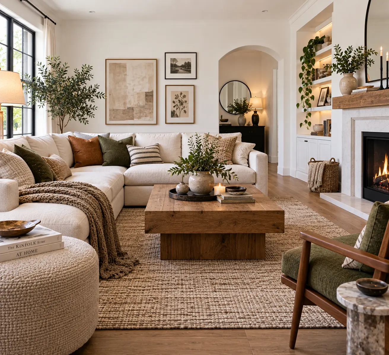
Flat, smooth white walls with nothing else going on are what read as sterile — the fix isn’t always a different color, it’s texture somewhere in the room to give the eye something to register beyond a flat plane. A textured rug, a boucle or linen sofa, a woven basket, or even a piece of art with visible brushstrokes or dimension all work against the flatness of a plain white wall without requiring any paint at all.
This is especially useful for renters, since none of it involves the walls directly. A living room can have entirely untouched white walls and still feel warm and layered if the furniture and textiles around it are doing enough textural work.
Pro Tip: If you’re adding texture through textiles, vary the texture type rather than just the color — a room with a boucle sofa, a jute rug, and a linen curtain reads as more intentional than a room where every textile is the same smooth cotton in slightly different shades of white or cream, even though the color palette is nearly identical.

- Low odor, easy clean up water-based orange peel aerosol wall texture
- Adjust texture pattern by rotating nozzle
- Match existing interior wall texture, eliminate bald spots
$15.79
2. Layer Different Whites and Off-Whites, Not Just One

Rather than treating “white walls” as a single flat color to be balanced entirely by other colors, layering two or three closely related whites and off-whites throughout the room — a warm white wall, a cream sofa, an oatmeal-colored rug — creates depth within the neutral palette itself, rather than relying only on contrast from darker accent colors to keep the room from feeling flat.
This tonal layering approach works because slight variations in white, sitting next to each other, actually read as more sophisticated and considered than a room where the wall is white and everything else is a completely different, unrelated color. It’s a subtler effect than adding a bold accent color, but it’s often what separates a white room that looks curated from one that looks unfinished.
3. Bring In Warm Wood and Natural Materials

Wood tones — especially warmer woods like oak, walnut, or rattan — do more to counteract the potential coldness of white walls than almost any other single design choice. A wood coffee table, a rattan chair, or open wood shelving against a white wall creates the kind of warm-cool contrast that keeps a neutral room from tipping into clinical territory, since wood grain has natural variation and warmth that flat white paint doesn’t.
This pairing also has a practical advantage: wood furniture generally works with a wider range of future decor changes than furniture in a specific trend color, so if you’re building a room around white walls partly because you don’t want to commit to a strong color scheme, wood tones keep that flexibility intact.
4. Use Trim and Molding for Contrast Without Adding Color
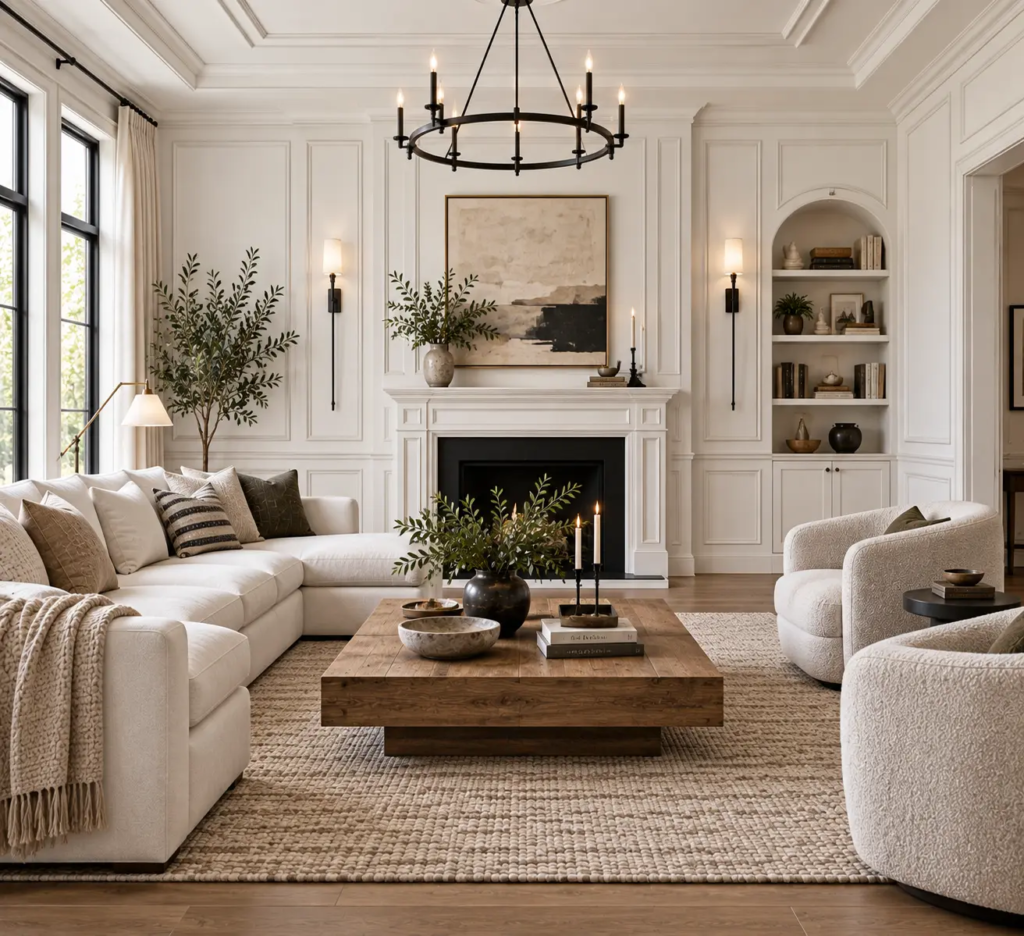
If the walls themselves need to stay white but the room still feels flat, adding or highlighting architectural detail — crown molding, a picture rail, wainscoting, or even just crisp, well-maintained baseboards — gives the eye visual structure and depth using only variations of white and shadow, no additional color required. A slightly different sheen between the wall and trim (say, matte walls with a satin or semi-gloss trim) is often enough to create this contrast even when both are technically the same white.
This works especially well in older homes with existing architectural detail that’s gone unnoticed under years of flat, uniform paint; repainting the trim in a crisper white or a slightly different white than the walls can make original moldings read as a deliberate design feature rather than something that’s just always been there.
For window treatments that work well against a white-and-trim backdrop, INTERNAL LINK: living room curtains ideas covers pairing fabric weight and hardware finish with a neutral wall.
Pro Tip: If you’re painting trim a slightly different white than the walls to create contrast, test the two together on the actual wall before committing — two whites that look distinct on paint chips can read as nearly identical once applied at full scale under your room’s actual lighting, which defeats the purpose of the contrast.

- 【Simple 3-step Installation】1️⃣ Cut 2️⃣ Peel 3️⃣ Stick (LxWxH: 10mx8mmx2.8mm)
- 【Widely Used】It can be used to decorate your mirror frame, floor, wall, ceiling, furniture, baseboard, ceramic tile and …
- 【Self-adhesive Design】Unlike traditional wood trim, our products can be used right out of the box without additional too…
$8.99
5. Ground the Room with a Darker Anchor Piece

A white living room doesn’t need to stay entirely light to avoid feeling stark — one deliberately darker anchor, like a black or deep walnut coffee table, a charcoal accent chair, or a dark-framed piece of art, gives the eye a place to land and keeps an all-white or mostly-white room from feeling shapeless. Without any darker element, a room built entirely from whites and light neutrals can start to lose definition, since nothing creates enough contrast to define where one piece of furniture ends and the next begins.
One anchor is usually enough; a room with several competing dark elements starts to lose the airy quality that made white walls appealing in the first place. If you already have a light-colored sofa against your white walls, this is where a piece like the option covered in INTERNAL LINK: white couch living room ideas becomes useful reference — pairing light furniture with white walls specifically needs a grounding element like this to keep the room from reading as one flat plane.
6. Warm Up the Room’s Actual Light Sources
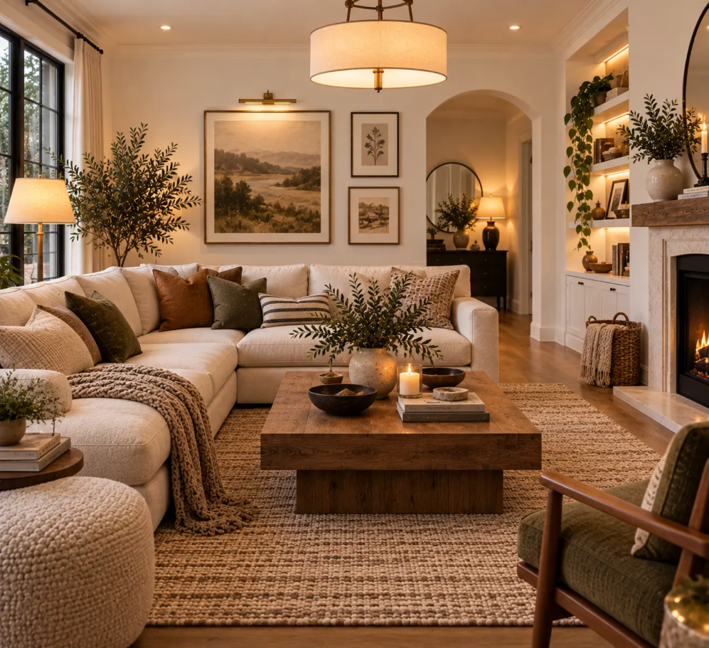
Cool-toned overhead lighting or daylight-temperature bulbs (5000K or higher) make white walls look considerably starker and more clinical than the same walls under warm-toned light (around 2700K to 3000K), especially once natural daylight fades in the evening. Swapping bulbs is one of the cheapest, fastest changes available here — it doesn’t touch the walls or furniture at all, but it changes how every white and neutral surface in the room reads once the sun goes down.
Layering multiple light sources at different heights — a floor lamp, a table lamp, and a dimmable overhead fixture rather than one bright ceiling light — also helps, since a single harsh overhead source tends to flatten a white room and emphasize any unevenness in the paint, while layered, lower light sources create the kind of shadow and warmth that a flat, single light source can’t.

- 4th of July Star Neon Lights : Our 2 PK star neon lights are the same colors as the American flag, excellent decorations…
- Dual Power Choices Easy to Use : This red white and blue star neon sign can be powered by USB (USB Cable Included) or 3 …
- Product Dimensions : H12″×W7.5″×D1.4″ (Star Light: H7.5″×W7.5″; Holder Base:H1.4″×W3.9″). Our red white and blue LED sta…
Common Mistakes to Avoid
Choosing white paint without testing the undertone under your room’s actual light. A white that looks perfect on a paint chip in a store can read cold or muddy once it’s on a large wall under your specific lighting, as covered in the foundation section.
Relying on the walls alone to make the room feel finished. White walls are a backdrop, not a finished look by themselves; a room with white walls and nothing textural, warm, or contrasting layered on top is what produces the sterile, unfinished feeling most people associate with the color.
Skipping a darker anchor entirely. An all-white or nearly-all-white room with no contrasting element can start to feel shapeless rather than airy, since nothing gives the eye a clear place to rest.
Using only cool-toned lighting. Bright, cool-temperature bulbs make white walls look more clinical, especially in the evening when they’re doing all the lighting work rather than sharing it with natural daylight.
Budget-Friendly Ways to Warm Up White Walls
None of this requires repainting, which makes white walls one of the more budget-flexible starting points in living room decor:
- Under $50: Warm-toned lightbulb swaps for your existing fixtures, or a textured throw pillow cover to add material variety.
- $100–$300: A jute or wool rug to add texture underfoot, or a wood-framed mirror or piece of art to introduce warmth without touching the walls.
- $300–$800: A rattan or wood accent chair, or a dark wood or black coffee table to serve as the room’s anchor piece.
Pro Tip: When shopping for a warm-wood anchor piece on a budget, look for solid wood secondhand furniture over new veneer pieces in a similar price range — solid wood typically develops a richer patina over time, while veneer can chip or peel at the edges within a few years of regular use, which shows more against a plain white wall than it would against a busier backdrop.
Bringing It Together
White walls in a living room only feel sterile when they’re left to do all the work alone. Get the undertone right for your room’s actual light, then layer in texture, warm wood, a darker anchor piece, and warmer lighting, and the same white that looked flat in an empty room starts to feel like a deliberate, calm backdrop instead. For more on building out the rest of the room’s palette and finishes once the walls are settled, INTERNAL LINK: living room aesthetic covers the broader styling decisions that pair well with a neutral wall foundation.
Frequently Asked Questions
Do white walls make a small living room look bigger? Generally yes, since white reflects more available light than darker colors, which can make a small room feel more open. This effect depends on getting a bright, slightly cooler white with good natural light in the room; a warmer, more muted white in a room with little daylight won’t have as strong an expanding effect.
What’s the best white paint undertone for a living room with little natural light? A warmer white with a faint yellow or cream undertone generally reads better in rooms with limited daylight than a stark, cool-toned white, since it doesn’t rely on abundant natural light to avoid looking flat or slightly grey under artificial lighting alone.
How do I add color to a white living room without repainting? Textiles, art, and accent furniture are the easiest ways to introduce color without touching the walls — a colored rug, patterned throw pillows, or a single upholstered accent chair let you test a color commitment-free, and they’re easy to swap out later if your taste changes.
Should trim be the same white as the walls or a different white? A slightly different white on trim than on the walls, usually in a different sheen (satin or semi-gloss trim against matte walls), creates subtle contrast and makes architectural detail stand out more than painting both the same flat white. Test both together on the actual wall before committing, since two whites can look more different on paint chips than they do at full scale.
Do white walls show dirt and scuffs more than other colors? White walls can show scuffs and marks more visibly than a mid-tone color simply because there’s more contrast between the mark and the wall, though a washable eggshell or satin finish makes cleaning marks off much easier than a flat matte finish, which tends to show cleaning attempts as a slightly different sheen.