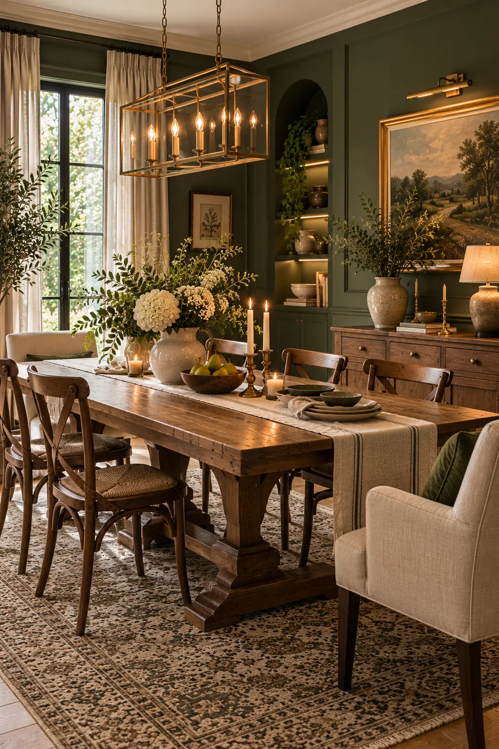
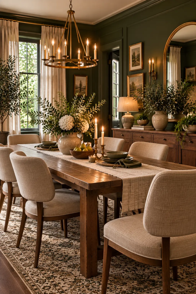
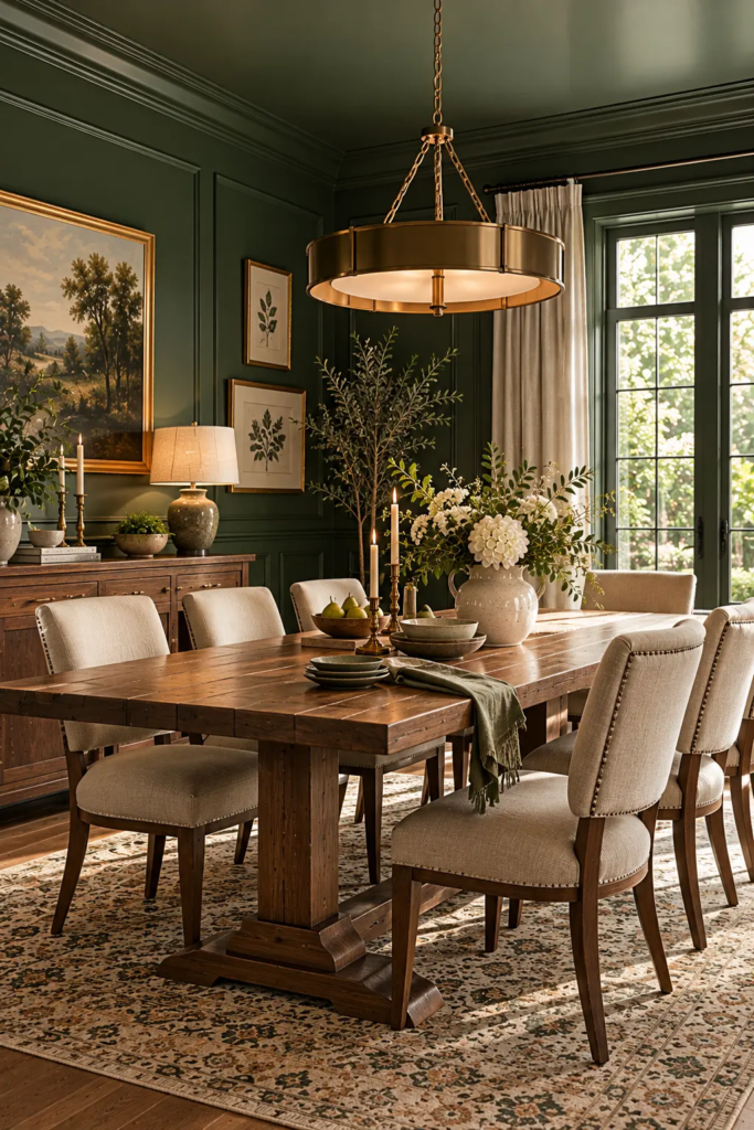
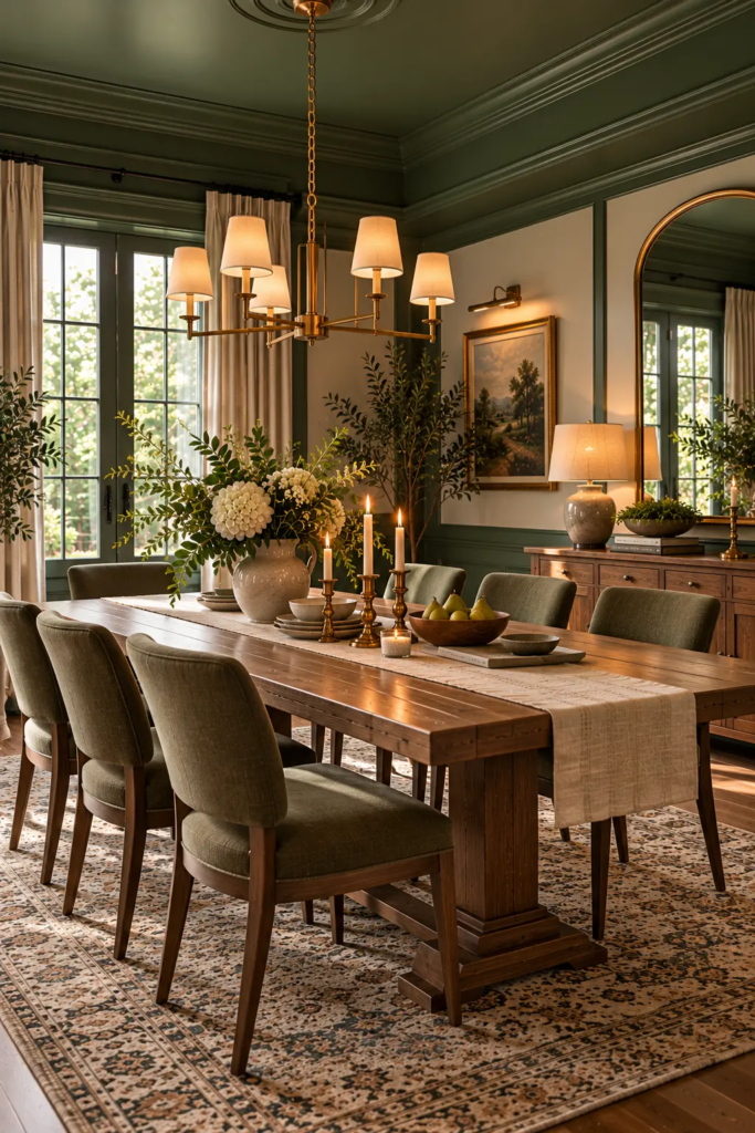
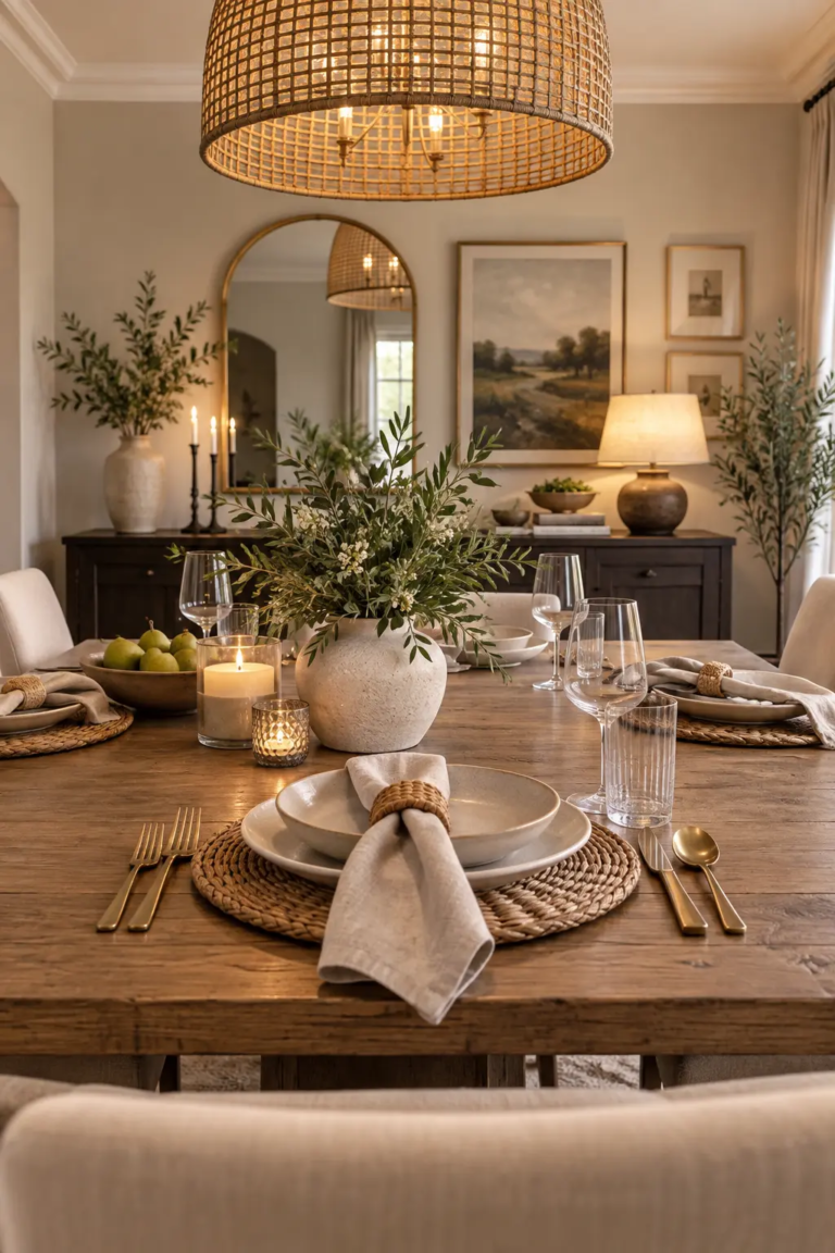
Dark green is one of the few bold wall colors that genuinely suits a dining room, and one of the easiest to get wrong. Done well, it makes a candlelit dinner feel like a restaurant you’d book weeks ahead. Done badly, it swallows the room, turns muddy by four in the afternoon, and leaves you wondering why the photo you pinned looked so different from your walls.
The gap usually isn’t the paint brand. It’s undertone, light, and what you put against the green. These 5 dark green dining room ideas tackle those three things directly, so the color reads as deep and intentional instead of just dark.
Why Dark Green Works Best in a Dining Room
Most dining rooms get used in the evening, for a couple of hours at a time, under artificial light. That’s the ideal setup for a dark color. You’re not living in the room all day, so the enclosed feeling is a feature, and candlelight and warm bulbs look richer against a deep wall than against white.
The catch is that dark paint absorbs light instead of bouncing it. A room that felt fine in pale beige can feel dim in dark green unless you plan for it. Everything below is about giving the green something to work with: the right undertone for your light, warm materials beside it, and several low light sources instead of one bright one.
Choose the Undertone by the Light in Your Room
Not all dark greens behave the same. Blue-leaning greens (deep emerald, spruce, bottle green) look crisp and dramatic in warm, direct light. Yellow- or black-leaning greens (olive, forest, moss) look softer and more grounded in cooler light.
That matters because of which way your windows face. A north-facing dining room gets cool, indirect light that pulls green colder and bluer, so a green with some warmth in it tends to read more inviting. A south- or west-facing room can carry a cooler emerald because the daylight adds warmth back.
Pro Tip: Test samples at night, not just in daylight. Paint two large sample boards, tape them to different walls, and look at them under your actual dining room bulbs after dark. That’s when you’ll use the room most, and it’s when a green that looked perfect at noon can suddenly read flat black or swampy.
https://pixabay.com
Paint the Trim and Ceiling on Purpose
Trim and ceiling decisions change how dark green feels more than most people expect. Crisp warm-white trim gives a clear, traditional frame, but a stark white can look harsh against a deep green. If you go that route, choose a white with a little cream in it.
The other option is to keep the trim or ceiling in the same green, or a shade lighter. It removes the hard edge where wall meets ceiling, which makes the room feel wrapped rather than boxed in, and it works especially well in a smaller space.
Pro Tip: Use a scrubbable eggshell or satin on the lower third of the wall, especially around chairs. Flat paint looks best on the upper wall, but it scuffs and marks at chair-back height within months. A chair rail or simple wainscot painted in satin solves the durability problem and adds a horizontal line that breaks up all that dark color.
Paint the Trim and Ceiling on Purpose
Green and warm wood are natural partners, since they both read as organic. A mid-tone oak, walnut, or cherry table looks richer against dark green than against almost any other wall color, because the wood’s orange and red undertones pull the green deeper by contrast.
Be careful with gray-washed or very pale woods here. Next to dark green they can look chalky and cold. Metals follow the same rule: aged brass, bronze, and warm gold-toned finishes glow against green, while chrome tends to feel sharp and a little clinical.
You also don’t need everything to match. A table and chairs in slightly different wood tones add depth that a perfectly matched set can’t, and a matched set against a saturated wall can look like a showroom display.
Layer Lighting for Evening
Because dark walls absorb light, a single overhead fixture on full brightness usually looks harsh in the middle of the room and dim at the edges. The fix is several softer sources.
Start with a dimmer on the overhead or pendant, if you can add one. Then add a lower layer: wall sconces, a picture light over art, or a plug-in lamp on a sideboard. Use warm bulbs, around 2200K to 2700K, so the green reads as rich instead of gray. Candles on the table add the last layer, and against a dark green wall they do more than any bulb.
Pro Tip: Hang a pendant so the bottom sits roughly 30 to 36 inches above the tabletop, and center it on the table, not the room. If the table sits off-center, the pendant should follow the table. A pendant that’s too high floods the room with glare and leaves the table itself dim.
https://plus.unsplash.com
Balance the Depth With Lighter Contrast
A dark green dining room needs at least a few light or reflective elements, or it starts to feel like one big block of shadow. A cream or oat-toned rug lightens the floor, linen curtains soften the window, and art with a wide, pale mat gives the wall places to breathe.
A mirror is especially useful. Hung opposite or beside a window, it bounces daylight back into the room, and in the evening it doubles the candle and sconce glow. The mistake to avoid is stacking dark on dark: a dark table, a dark rug, and dark curtains against dark walls leaves nothing for the eye to rest on.
Pro Tip: Thrifted mirrors and frames are ideal here. Aged gilt, brass, or worn wood frames look richer against dark green than new ones, and the deep wall color hides minor scratches and wear. One large secondhand mirror usually does more for the room than several new pieces of art.
https://media.istockphoto.com
Common Mistakes to Avoid
Judging the color from a tiny swatch. Dark colors shift a lot with light, so use large samples and check them at night.
Using flat paint where chairs hit the wall. It scuffs fast and is hard to touch up cleanly.
Relying on one bright overhead light. Dark walls need several low sources, not one strong one.
Pairing green with cool, pale woods and chrome. The contrast turns cold instead of rich.
Stacking dark on dark. Without light textiles or a mirror, the room loses its depth.
Budget-Friendly Ways to Adapt These Ideas
Low budget: Paint one wall or the lower half of the room instead of everything, swap in warm bulbs, and add candles. If you rent and can’t repaint, stick to removable pieces like candles, lamps, and a large leaning mirror.
Mid budget: Paint the whole room with a scrubbable finish, add a dimmer switch, and bring in a large secondhand mirror and a light-toned rug.
Higher budget: Add wainscot or paneling painted in the same green, plug-in or hardwired sconces, and a solid wood table in a warm tone.
FAQ
Does dark green make a dining room look smaller? It can make the walls feel closer, but it also blurs corners and edges, which often makes a room feel cozier rather than cramped. Painting the trim and ceiling in a similar tone helps, because it removes the hard lines that make a room read as a box.
What color goes best with a dark green dining room? Warm neutrals like cream, oat, and warm white are the safest partners, along with warm wood and aged brass. For accents, muted terracotta, rust, and soft blush all sit well against green without competing with it.
What finish should I use for dark green walls in a dining room? Eggshell or satin is the practical choice because it wipes clean, which matters near chairs and a table. Flat can work on the upper wall of a room where you want the softest look, but it marks easily at chair height.
Is dark green too dark for a room with little natural light? It can work, but pick a green with some warmth in it and plan for layered artificial lighting. In a low-light room, a cool blue-green can turn muddy, while an olive or forest green usually holds up better.
Should the ceiling be painted too? Painting it a lighter shade of the same green, or the same green in a matte finish, makes the room feel more wrapped and intentional. A stark white ceiling isn’t wrong, but it creates a sharp line that highlights how dark the walls are.
The Takeaway
A dark green dining room works when the green has something to play against: warm wood, aged brass, low layered light, and a few light or reflective surfaces to keep the room from going flat. Choose the undertone for your light, test it at night, and these 5 dark green dining room ideas give you a room that feels rich at dinner and still holds up in daylight.
Most dining room interior advice is photographed from the doorway, the one spot nobody occupies for long. Real meals happen seated, with your eyes about 40 to 45 inches off the floor, looking at the person across from you, the wall behind them, and whatever light hangs in between. Design for that view and the…
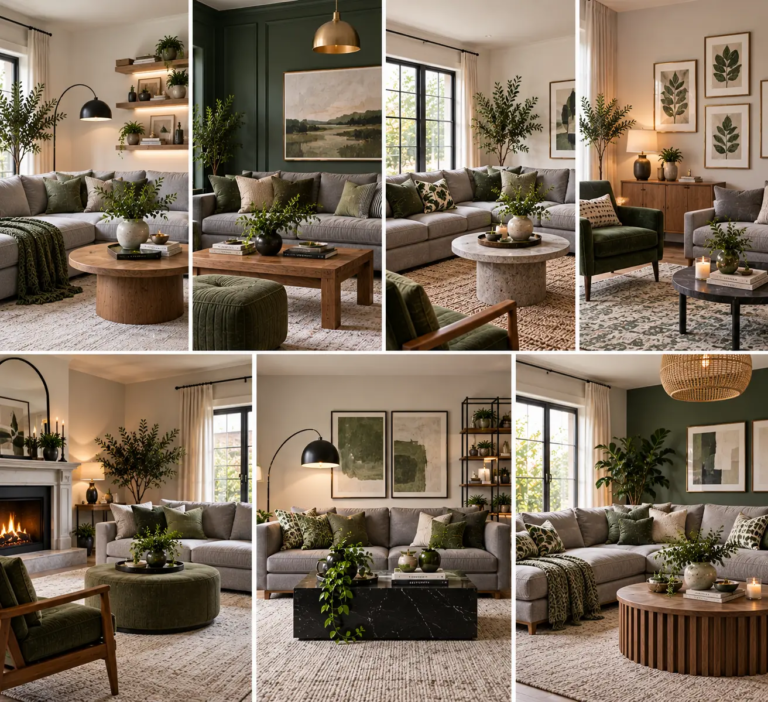
Grey and green sounds like an easy pairing on paper — one neutral, one nature-adjacent accent — and then you actually put it together and the room ends up feeling like a dentist’s waiting room instead of the calm, layered space you had in mind. That’s not a coincidence. Grey and green are two of…
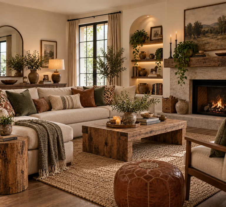
Most rustic living room inspiration comes from homes that already have the bones for it — exposed timber beams, a stone fireplace, wide-plank original flooring. That’s not most homes. Most living rooms have flat drywall, builder-grade window trim, and wall-to-wall carpet or laminate flooring, and none of that disappears just because you bring in a…
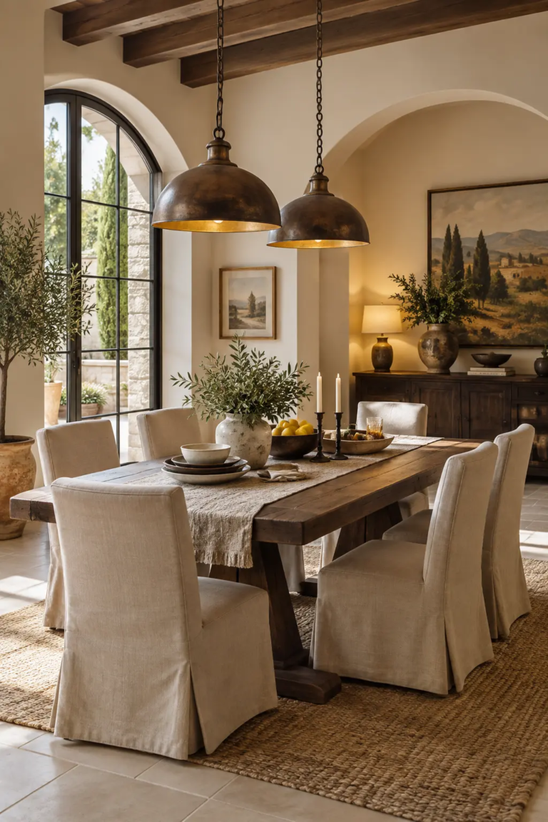
Most “Italian dining room” inspiration photos are staged for one specific moment: a long table set for twelve, candles lit, a holiday-worthy spread. It’s a beautiful photo and a completely unrealistic room. The truth is most people eating in a dining room styled this way use it for a Tuesday dinner with two kids and…
Open Kitchen Dining Room: Stylish Ideas for a Warm and Functional Home An open kitchen dining room is one of the most inviting ways to create a connected, welcoming home. Instead of separating the kitchen and dining area with walls, this design combines the spaces into one flowing environment where cooking, dining, entertaining, and everyday…
You can spend serious money on curtains and still end up with flat rectangles hanging beside the window. You can also spend modestly and get drapery that looks like it came from a workroom. The gap between the two is rarely fabric price. It comes down to how much cloth is gathered, where the rod…