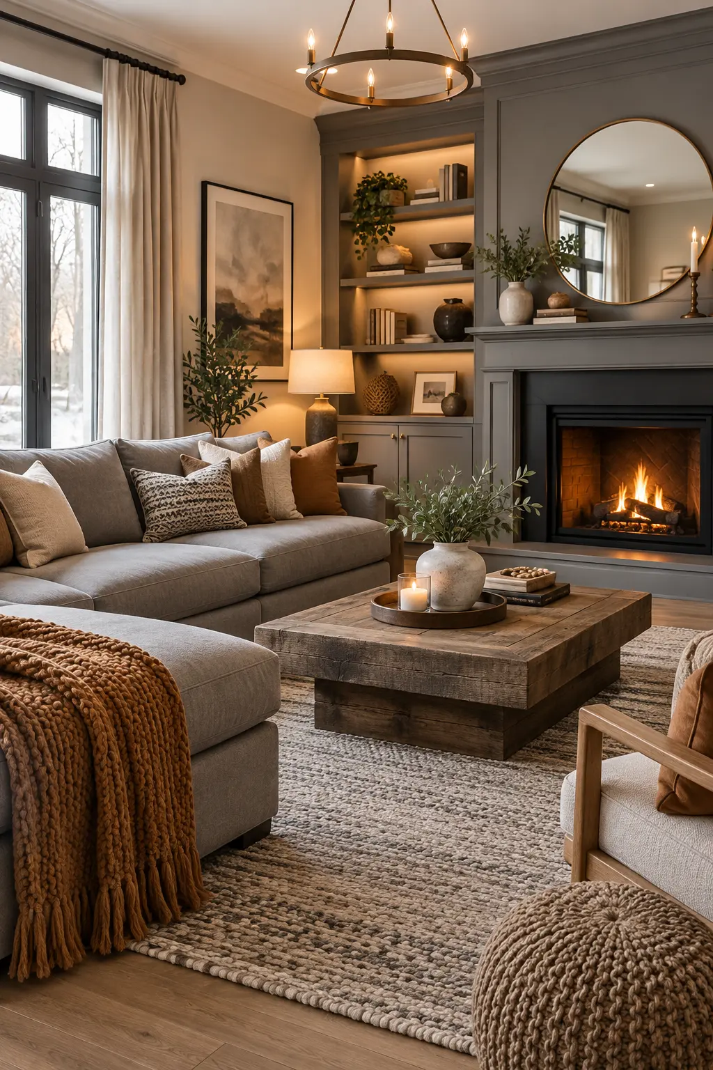
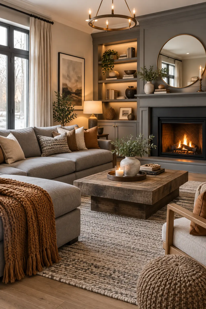
Gray got popular for good reason — it’s flexible, it photographs beautifully, and it pairs with almost anything. But a lot of people who commit to a gray living room end up somewhere they didn’t expect: a room that looks right in the paint swatch and wrong in real life, cold and a little flat no matter what pillows get added. The gray itself usually isn’t the problem. The undertone is.
This is the actual issue worth solving: most gray-living-room disappointment comes down to picking a gray with the wrong underlying tone for the room’s light, then trying to fix it with accent colors instead of addressing the base gray first. Get the undertone right, and gray becomes one of the warmest, most livable neutral choices available. Get it wrong, and no amount of decor layered on top fully corrects it.
The Foundation: Every Gray Has a Hidden Undertone
Gray paint and gray fabric are never truly neutral — they carry a secondary tone underneath, usually blue, green, purple, or a warm beige-brown base. This undertone is invisible on the paint chip in the store but becomes obvious once it’s on a full wall under your room’s actual light. A blue-undertone gray in a room with limited natural light can read as flat and almost institutional by late afternoon, while the same gray in a bright, south-facing room might look perfectly fine.
The fix isn’t avoiding gray — it’s matching the undertone to your room’s light conditions, and then reinforcing warmth through materials and layering rather than fighting the base color with everything else in the room.
Pro Tip: Paint a sample on foam board, not directly on the wall, and move it around the room across a full day — a gray that looks warm near the window can shift noticeably cooler on an interior wall with less direct light, and testing in only one spot misses that.
1. Choose a Warm-Undertone Gray If Your Room Gets Limited Light
If your living room faces north, sits under a covered porch, or just doesn’t get strong direct sun, lean toward a gray with a warm undertone — often described as “greige” or having a beige or taupe base rather than blue or green. These grays hold onto some warmth even in flat, indirect light, where a cooler gray can start to look almost silvery-blue and sterile once the sun moves past the room.
A useful way to check before committing: look at the paint chip next to a plain manila folder. If the gray reads distinctly cooler than the folder’s warm tone, it likely has a cool undertone that will need more work to feel cozy in low light.
https://pixabay.com
2. Layer in Warm Wood Tones, Not Just Warm Colors
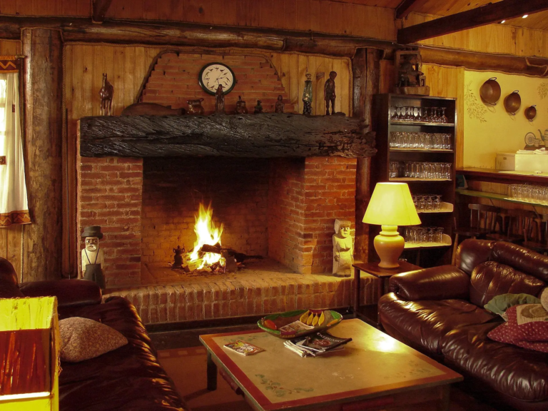
One of the most common mistakes in a gray living room is trying to counteract coolness entirely through color — adding orange or rust accent pillows, for instance — without addressing material. Warm wood tones do more of this work than color alone. A walnut or warm oak coffee table, wood-framed art, or a rattan or cane accent chair introduces genuine warmth through material grain and tone, which reads as warmer to the eye even next to a cool-undertone gray sofa.
Pro Tip: If your existing wood furniture runs cooler-toned (gray-washed oak, for example), a single warmer wood piece — even just a side table — creates enough contrast to keep the whole room from reading as one flat cool palette.
3. Choose a Gray Sofa Fabric With Some Texture, Not Flat Weave
A smooth, flat-weave gray sofa fabric reflects light evenly across its surface, which can make the whole piece look one-dimensional and a little cold, especially under overhead lighting. A textured weave — bouclé, a slight tweed, a brushed velvet — catches light unevenly across its surface, creating visual depth that a flat weave can’t. This matters more with gray specifically than with a warmer color, since gray has less inherent visual interest to begin with and depends more on texture to avoid looking flat.
If you’re working with an existing gray sofa and don’t want to reupholster, styling approaches built specifically around a gray couch cover how to layer texture and warmth around a piece you already own rather than starting over.
https://pixabay.com/
4. Use Metal Finishes to Set the Room’s Temperature
Metal accents — lamp bases, picture frames, hardware — carry their own undertone that either reinforces or fights a gray room’s coolness. Warm metals like brass, aged brass, or copper add visual warmth that plays well against cool-undertone gray, essentially balancing the palette the way warm wood does. Cooler metals like chrome or brushed nickel tend to amplify a gray room’s coldness rather than counter it, so if your gray leans cool, this is one of the easier swaps to make since lamps and hardware are relatively inexpensive to replace.
https://pixabay.com
5. Add Color Through Saturated Accents, Not Pastel Ones
Gray pairs surprisingly well with color, but the shade of that color matters. Soft pastels — pale blush, baby blue, mint — tend to disappear into a gray room or read as washed out next to it, since both the gray and the pastel are working in a similarly muted range. Saturated, deeper colors — a true forest green, a deep rust, a rich mustard — create actual contrast against gray instead of blending into it, which is what makes the accent color register as a deliberate design choice rather than an afterthought.
6. Don’t Skip a Rug Just Because the Floor Is Already Neutral
In a gray living room with light or neutral flooring, it’s tempting to skip a statement rug since “everything’s already neutral.” But this is often where the room loses its last opportunity for warmth and texture at floor level. A rug with visible pile texture — a chunky wool weave, a Moroccan-style shag, a jute-wool blend — adds both warmth underfoot and visual interest without needing to introduce a bold color if you’d rather keep the palette calm.
Pro Tip: Size the rug so all your seating group’s front legs sit on it, not just the coffee table — a rug that’s too small and only reaches partway under the furniture makes a gray room look even more sparse and cold than a slightly undersized rug would in a warmer-toned room, since there’s less color variation to distract from the gap.
https://plus.unsplash.com
Common Mistakes to Avoid
Fighting a cool undertone with warm paint colors elsewhere in the room. Trim, ceiling, and adjoining hallway colors that clash undertones with the main wall color make the whole space feel disjointed rather than warmer — better to solve the undertone at the source.
Relying only on overhead lighting. Flat overhead light emphasizes gray’s coolness more than warm lamp light does. Table and floor lamps with warm-temperature bulbs (around 2700K) do more to soften a gray room’s temperature than any accent color choice.
Choosing every accessory in the same gray tone. A room where the walls, sofa, curtains, and rug are all nearly identical shades of gray reads as flat rather than cohesive — varying the tone slightly (a warmer gray sofa against cooler gray walls, for instance) adds the depth a monochrome room needs.
Assuming all grays photograph and live the same. A gray that looks great in an Instagram-lit photo may look completely different in your room’s actual daylight and lamp light — always test in your own space before committing to a large-format purchase like a sofa or a full paint job.
FAQ
What’s the warmest gray paint undertone for a living room? Grays with a beige or taupe base, often labeled “greige,” read warmest, especially in rooms with limited natural light. Avoid grays with a strong blue or purple undertone if your room doesn’t get much direct sun, since those tend to look coldest in indirect light.
Does gray work in a small living room, or does it make the space feel smaller? Gray itself doesn’t shrink a room — a cool-undertone gray combined with cool lighting and no texture is what creates that cramped, flat feeling. A warm-undertone gray paired with layered lighting and varied texture can work just as well in a small room as in a large one.
What colors pair best with gray in a living room? Warm, saturated tones — rust, mustard, deep green, terracotta — create the most effective contrast against gray, since pastel and muted tones tend to blend into gray rather than standing out against it. The saturation level matters more than the specific hue chosen.
Should I choose a warm or cool gray if my room gets a lot of natural light? A room with strong, consistent natural light has more flexibility and can handle a cooler-undertone gray without it reading as cold, since ample daylight compensates for what a dimmer room can’t. In lower-light rooms, warmer undertones are the safer choice.
How do I keep a gray living room from looking like a corporate office? The main culprits are flat-weave fabrics, cool metal finishes, and a total absence of texture or wood tone. Adding a textured rug, warm wood furniture, and at least one saturated color accent shifts the room away from that flat, uniform look.
The Takeaway
A gray living room isn’t inherently cold — it just needs the undertone matched to your room’s actual light, and enough texture and warm material layered on top to keep it from going flat. Start by testing your gray in your own space across a full day, then build warmth through wood, texture, and saturated color rather than trying to fix the base tone with accessories alone.
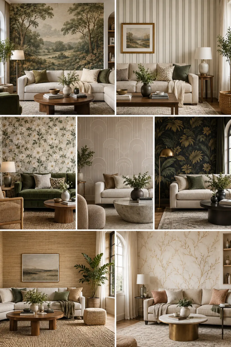
Most people choose living room wallpaper the way they choose a throw pillow: they see a pattern they like, buy a few rolls, and hope it works. Then it goes up and the room feels smaller, or the ceiling feels lower, or the seam lines catch every bit of afternoon light. Wallpaper isn’t decorative in…
7 Dining Room Carpet Ideas That Hold Up to Real Meals A dining room carpet gets a harder daily test than almost any other rug in the house. It sits under chairs that scrape in and out several times a meal, it catches crumbs and the occasional dropped glass of wine, and it needs to…
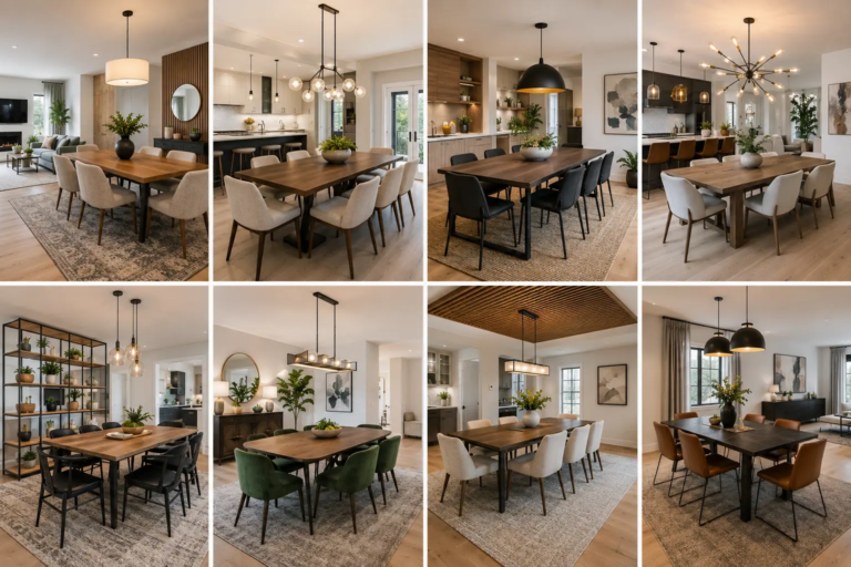
If your dining room doesn’t actually have four walls, most “modern dining room” inspiration doesn’t quite fit. It assumes a defined room with its own paint color and light fixture doing all the visual work. But if your dining space flows into the kitchen and living room — true for most homes built or renovated…
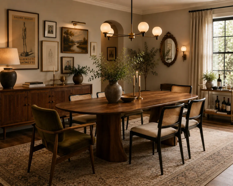
A vintage modern dining room usually goes wrong one of two ways. Either every piece is its own standalone “statement,” so the room feels like a showroom floor with no relationship between the objects, or one vintage piece gets dropped into an otherwise brand-new room and looks like it wandered in from a different house….
Most living room mirror advice stops at “hang one across from a window to bounce light around the room,” which is true but incomplete. A mirror doesn’t just reflect light — it reflects whatever’s in front of it, and that’s the part most guides skip. Hang a beautiful mirror across from a cluttered bookshelf, a…
A half bathroom, often called a powder room, may be one of the smallest spaces in your home, but it offers huge opportunities for creativity and design. Typically featuring only a toilet and sink, this compact room serves an important purpose for guests while adding convenience for household members. Because of its limited square footage,…