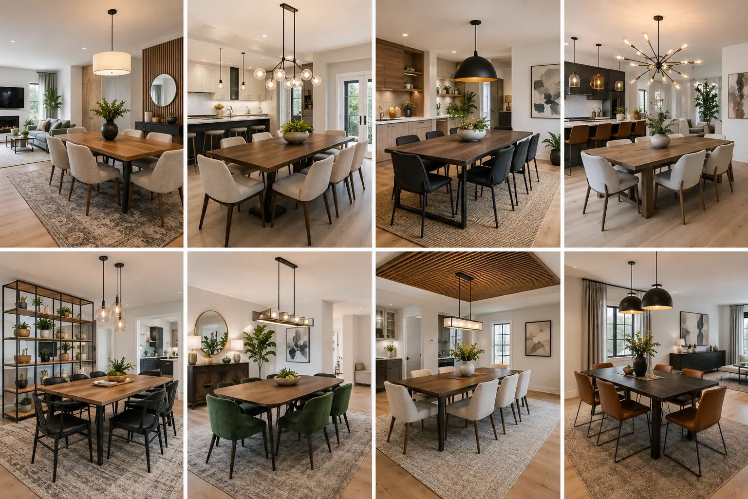
If your dining room doesn’t actually have four walls, most “modern dining room” inspiration doesn’t quite fit. It assumes a defined room with its own paint color and light fixture doing all the visual work. But if your dining space flows into the kitchen and living room — true for most homes built or renovated in the last two decades — that advice doesn’t transfer. You’re not decorating a room. You’re making one appear inside a bigger, shared space.
That’s a spatial problem, not a style one, and it’s what this guide solves: eight ways to give an open-concept dining area its own identity using rugs, lighting, materials, and furniture scale — the things that do a wall’s job when there’s no wall.
[IMAGE: An open-concept great room where a dining table sits between a kitchen island and a living area, with a large jute rug and a linear pendant light visually separating the dining zone — bright, airy, minimal styling]
Why “Modern” Means Something Different in an Open Floor Plan
In a closed room, modern is mostly a style choice — clean lines, mixed materials, minimal ornamentation. In an open layout, it has an extra job: creating enclosure through visual cues alone, since there’s no architecture to lean on. A rug isn’t just texture underfoot — it’s the floor plan of a room that doesn’t technically exist. A pendant isn’t just light — it’s a ceiling. Ask “what would a wall do here” and the rest gets easier. [INTERNAL LINK: open kitchen and dining room layout ideas]
Pro Tip: Scan the space from the entrance for three seconds. If you can’t tell where the dining “room” starts, your zoning cues aren’t strong enough — add contrast before adding furniture.
1. Size the Rug to the Table, Not the Room
The biggest zoning tool in an open layout is a rug bigger than beginners tend to choose. For a standard 6-seat table (roughly 60″ x 38″), go at least 8×10, ideally 9×12, so every chair stays on the rug even pulled out. A too-small rug is the classic mistake — it makes the area look like it’s floating instead of anchored, and barely registers as a zoning cue at all.
[IMAGE: Close-up of dining chairs pulled out from a table, all four legs still resting on a large flatweave rug, wide plank oak floor visible around the edges]
2. Let a Statement Light Fixture Draw the “Ceiling”
Without walls, your dining zone still needs a top boundary — that’s the pendant’s job. Hang it 30 to 34 inches above the tabletop, and size it generously; a fixture that feels “too big” alone usually reads correctly over a table in a large open room. A small flush-mount gets swallowed by high ceilings and signals nothing.
3. Contrast the Table Finish Against the Kitchen Cabinetry
When your table shares sightlines with the cabinets, matching finishes too closely blurs the area into one block. White oak cabinetry next to a blackened-steel table base or dark walnut top creates enough contrast for the eye to register a separate zone. It’s subtler than a rug, but works even in small apartments where those options don’t fit. [INTERNAL LINK: minimalist dining room styling ideas]
Pro Tip: If your furniture ends up close in tone by accident, a runner or placemats in a contrasting texture — linen against glossy lacquer, say — recreates the separation without new furniture.
A built-in or upholstered banquette gives the zone a fixed edge on one side — useful when the space feels like an in-between pocket rather than a real room. Pair it with chairs on the open side, not benches on both, to avoid a “booth” feel and keep the walk-through clearance open plans depend on.
[IMAGE: A curved boucle banquette built into a corner nook, round marble-top table, two brass-frame chairs on the open side, morning light from a nearby window]
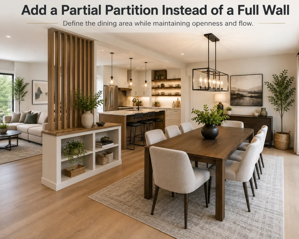
5. Add a Partial Partition Instead of a Full Wall
With any renovation budget, a slatted wood screen, half-height wall, or open shelving unit can define the zone architecturally without blocking light. Place it perpendicular to the sightline from the entry so it reads as a subtle break, not a barrier.
[IMAGE: A vertical slatted oak wood screen partially separating a dining area from a living room, dining table with rattan chairs visible through the gaps]
6. Paint or Panel Just the Dining Zone’s Wall Plane
Color-drenching one wall or architectural plane behind the table is one of the most affordable ways to fake a room. A deep terracotta, forest green, or charcoal segment gives the eye somewhere to land, doing more “distinct space” work than you’d expect. Keep the ceiling and adjacent walls neutral so the color reads as intentional, not random.
[INTERNAL LINK: related post on choosing the right wall color for open living spaces]
Pro Tip: Test the color on the actual wall at different times of day — a plane bordering a kitchen skylight and evening lighting can shift dramatically, moody at 7pm and muddy by noon.
7. Break the Room’s Grid With Table Shape and Angle
Open kitchens and living rooms almost always sit on a rectangular grid — island parallel to cabinets, sofa parallel to the TV wall. A round table, or a rectangular one angled 10-15 degrees off that grid, reads as its own decision rather than an extension of the kitchen. It’s especially effective in narrow galley layouts, where a round table also improves traffic flow.
[IMAGE: A round black steel-base dining table angled slightly off the kitchen island’s line, four curved wood chairs, warm minimal styling with a single ceramic vase]
8. Layer Lighting So the Zone Can Shift From Day to Night
A single overhead fixture treats the area as a utility space; layered lighting treats it as a room with its own mood. Add a dimmer to the main pendant, then bring in one lower source — a console lamp or plug-in sconce — so you can dial the zone down for dinner without touching the kitchen’s task lighting. That’s what makes it feel like its own room after dark, when daytime visual tricks are harder to see.
Common Mistakes to Avoid
Undersizing the rug. A 5×8 under a table that needs an 8×10 leaves chair legs falling off the edge — unfinished, not modern.
Matching every finish to the kitchen. Too much coordination erases the contrast you’re relying on for separation.
Hanging the fixture too high or small. Standard ceiling height (7+ feet) instead of 30-34 inches kills the “ceiling” effect.
Blocking the walkway. Leave at least 36 inches of clearance between the table’s edge and the nearest traffic path.
Skipping contrast entirely. Without one deliberate point of contrast, the area rarely reads as its own space.
[IMAGE: A cramped dining vignette showing a too-small rug with chair legs hanging off the edge, illustrating the sizing mistake, neutral background]
Budget-Friendly Ways to Get the Same Effect
You don’t need a partition or custom banquette to pull most of this off. A large flatweave or jute rug is the most cost-effective zoning tool and the first upgrade worth making on a tight budget. Swapping just the light fixture defines the space more than a full furniture refresh. If a new table isn’t in the cards, restaining a secondhand one in a contrasting tone gets you most of idea #3 for the cost of sandpaper and stain.
Pro Tip: Buy the rug pad before the rug. One that slips on hardwood or crushes without padding looks worse within months than a smaller, properly anchored rug.
[INTERNAL LINK: related post on small dining room ideas for making a compact space feel bigger]
FAQ
How do I define a dining area without building walls? Layer at least two zoning cues — a large rug plus a statement fixture is the most reliable combination. Color or material contrast against the kitchen adds a third layer for stronger separation.
What size rug works under a dining table in an open-concept space? Go 24-30 inches larger than the table on every side, so all four chair legs stay on the rug even pulled out. For a standard 6-seat table, that’s usually 8×10 or 9×12.
How high should a pendant hang over a table with no walls? 30 to 34 inches above the tabletop, staying toward the lower end so the fixture still reads as its own “ceiling” rather than blending into the room’s general lighting.
Can a small open-concept space still have a defined dining room? Yes — a round table, a correctly sized rug for the smaller footprint, and one contrasting wall or material choice can do it. Skip the partition or banquette; they add weight a tight layout can’t absorb.
Do the dining chairs and kitchen barstools need to match? No — matching too closely can blur the zones together. A shared material family, like wood-and-metal on both, creates cohesion without requiring identical pieces.
What colors work best for a modern dining room next to an open kitchen? Neutrals with one deliberate contrast point. Keep the shared floor and ceiling neutral, then let a wall segment, the table finish, or the fixture carry a bolder tone.
The Real Takeaway
None of these eight ideas require a renovation, and most can be tested with what you already own. Move your existing rug to the right position and see how much the zone tightens up. Try angling the table ten degrees before buying a new one. The goal isn’t a walled-off dining room — it’s giving the eye enough deliberate cues that it stops reading the space as extra kitchen floor and starts reading it as a room in its own right. [INTERNAL LINK: more dining room decor ideas]
Most black bathrooms fail for the same reason: someone paints every surface the same shade of black and calls it moody. It isn’t moody. It’s a parking garage with a toilet in it. The bathrooms that actually work — the ones that look expensive rather than experimental — treat black as a material to place…
A modern luxury living room is more than just a beautifully designed space—it is a reflection of refined taste, comfort, and functionality. As the heart of the home, the living room serves as a gathering place for family, guests, and moments of relaxation. Combining contemporary aesthetics with premium materials and thoughtful design elements can transform…
A green sofa can dominate a room before you’ve added anything else. That’s the advantage—and the problem. Choose the wrong wall color, rug, or accent pieces, and the sofa starts looking disconnected. Choose the right supporting pieces, and it becomes the easiest starting point for the entire room. The key isn’t finding more green accessories….
Cottage Dining Room Ideas for Small, Older Rooms That Still Feel Grown-Up A cottage dining room looks effortless in photos — a long wood table, mismatched chairs, a window full of soft light — but most of those photos are shot in rooms with 9-foot ceilings and oversized windows that don’t reflect what a real…
Before choosing furniture or colors, the most useful thing you can do in a shared or multi-purpose room is give the study corner a visual boundary, even a small one, so it reads as a distinct zone rather than just “the side of the room where the desk happens to be.” In a room with…
The dining rooms in cottage photos come with help: a low beamed ceiling, a deep-set window, walls that bow slightly where the plaster has settled. Yours is more likely a rectangle with an 8-foot flat ceiling, a builder-grade window and perfectly straight drywall. That’s workable. The cottage feeling comes from a handful of decisions about…