Spanish Living Room Ideas for a Home Without Archways
Spanish Living Room Ideas for a Home Without Archways
Search “Spanish living room” and most of what comes back assumes you’re starting with a plaster archway, a beamed ceiling, or terracotta floor tile already in place. If your actual living room is a standard rectangular box with drywall and a builder-grade window, that gap between the inspiration photo and your real walls is exactly where most people give up on the style entirely — or worse, order a fake stucco wall panel that ends up looking like a theme restaurant.
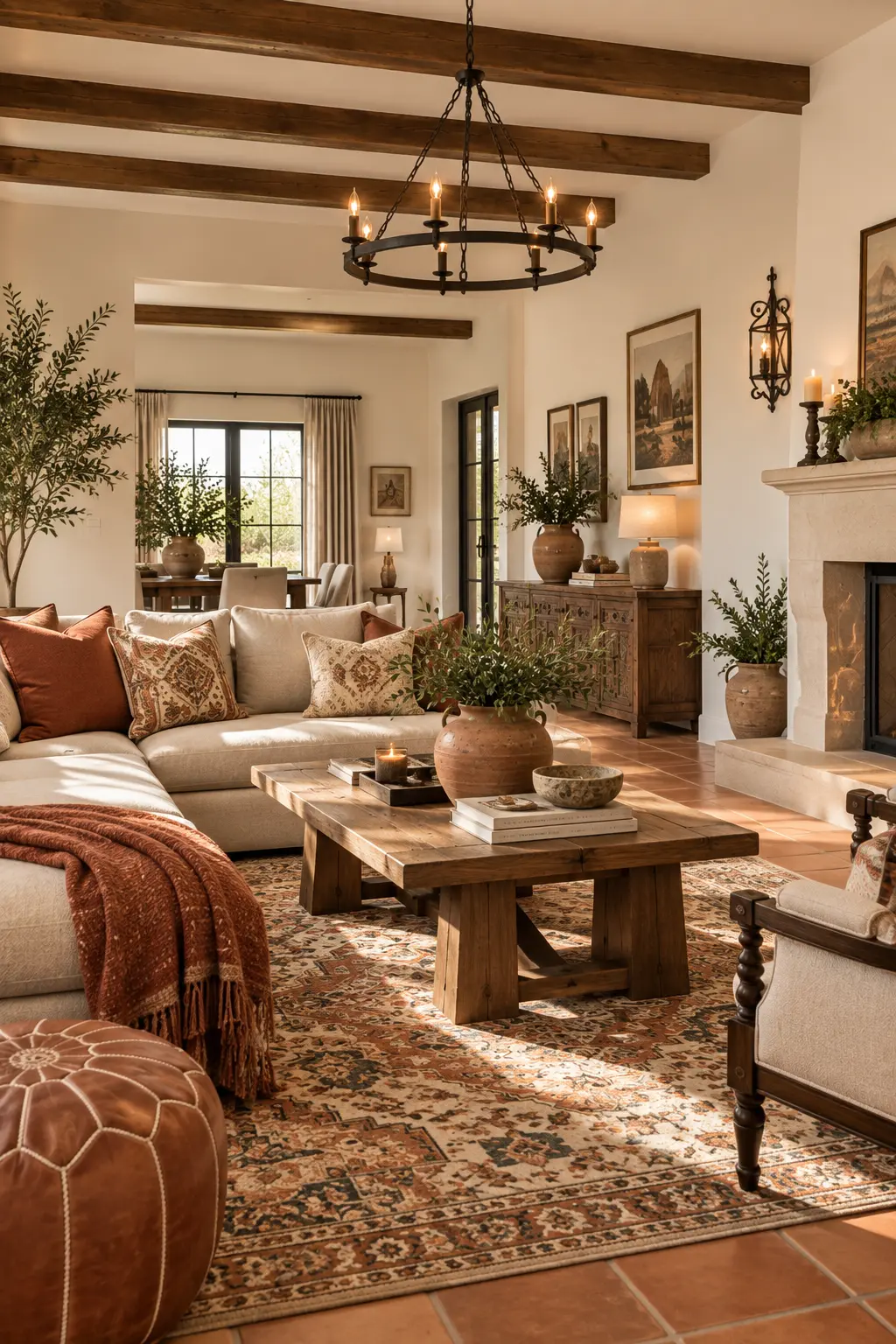
Spanish living room style doesn’t live in the architecture. It lives in a specific combination of warm plaster-toned color, iron and wood detailing, and textiles with visible hand-work — all of which you can layer onto a completely plain room. This is the angle worth taking: what to actually buy and place when your living room has none of the architectural bones the style is usually photographed with.
The Foundation: Spanish Style Is a Material Language, Not a Floor Plan
Before picking individual pieces, it helps to understand what’s actually doing the work in a Spanish-influenced room. Three material categories carry almost all of the visual identity: warm, earthy plaster or terracotta-adjacent color on the walls; dark, often hand-forged iron in lighting and hardware; and natural fiber textiles — wool, jute, raw linen — with visible weave or fringe rather than flat, machine-finished fabric.
None of these require construction. A wall color, a pendant light, and a few textiles can carry the entire look on a completely standard wall, which is why this style translates better to a rental or a plain room than people assume.
Pro Tip: Choose a wall color with a slight pink, ochre, or clay undertone rather than a true neutral beige — the warmth in that undertone is what reads as “plaster” to the eye, even on flat drywall, while a cooler beige reads as generic builder-grade no matter what furniture surrounds it.
1. Start With a Warm, Earthy Wall Color
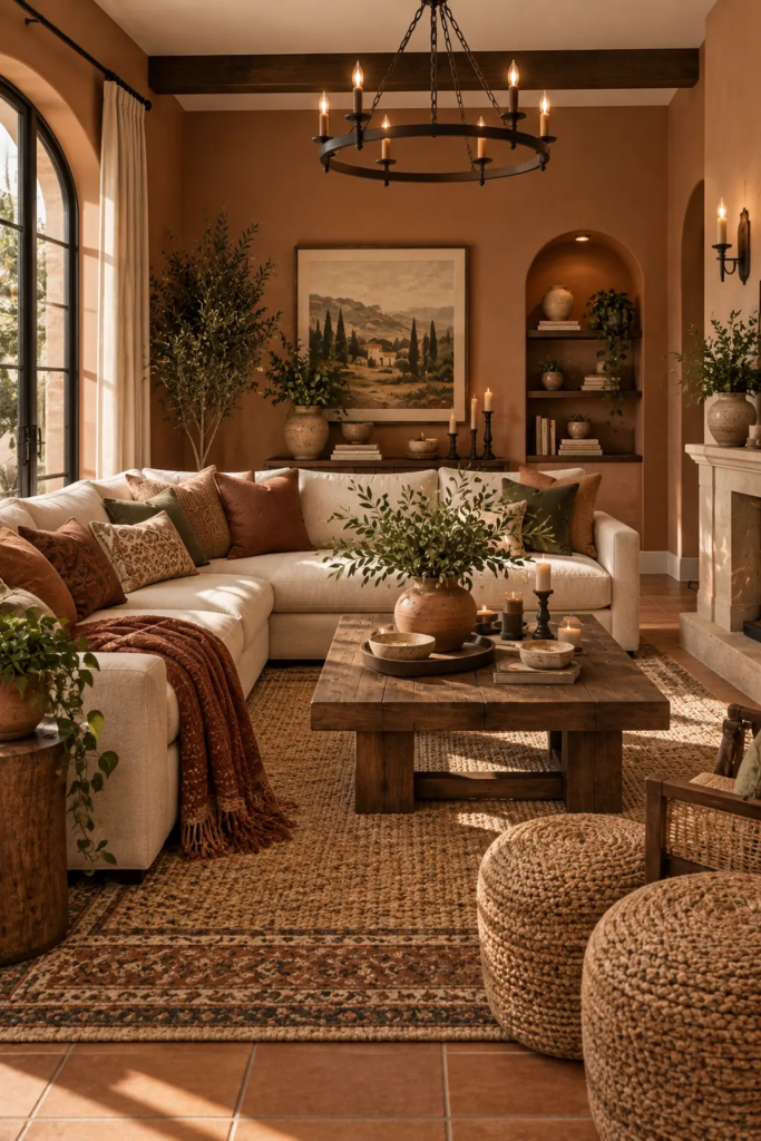
The single highest-impact change in a Spanish-inspired room is wall color, and it needs to lean warmer than most people’s instinct. Think terracotta, warm ochre, dusty rose-clay, or a deep rust — not the cooler greige that’s dominated the last decade of living room paint. If a full-wall color commitment feels risky, painting just the wall behind the primary seating area gives you the warmth without repainting the whole room.
If your current walls are white or off-white and a full repaint isn’t in the plan yet, warming up white walls without losing brightness is a lower-commitment first step that still moves the room toward this palette.

- ROAD TO PROGRESS ART: This motivational canvas shows a glowing highway leading into bright sunrise, with a turtle moving…
- MODERN DARK PALETTE: Black road shadows, copper clouds, golden sunlight, desert brown terrain, and soft blue gray sky cr…
- FRAMED WRAPPED LOOK: The wrapped canvas format creates a finished edge and dimensional profile, helping the artwork look…
2. Bring in Iron Where Wood Would Normally Go
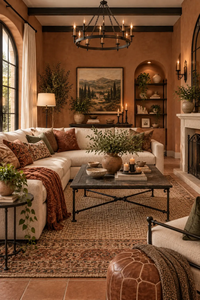
Dark, matte iron — not polished black metal, which reads more industrial than Spanish — shows up in this style anywhere hardware or structure would normally be wood or brass. A wrought-iron pendant light over a seating area, iron drawer pulls on an existing console, or an iron-framed mirror all introduce the material without requiring any renovation. The finish matters here: a hand-forged, slightly uneven texture reads as authentic, while a perfectly smooth matte black finish reads closer to modern industrial.
Correct mirror placement matters as much here as the frame choice — an iron-framed mirror hung to reflect a window rather than a blank wall does double duty, adding both the material detail and functional light.

- Custom Branding Iron: Elevate your crafts, wedding decor, and gifts with a personalized logo or design. Our custom brand…
- High Quality and Durable: Made from premium brass, our branding iron is designed for durability and a long service life….
- Ease to Use: Install the wood handle and brass stamp, heat on fire for about 2-3 minutes, brand the surface by holding f…
3. Layer Textiles With Visible Hand-Work

This is where the style lives most affordably. A wool throw with visible fringe, a jute or sisal rug with a chunky weave, and pillow covers in raw linen or a hand-loomed textile all carry more of the Spanish-influence identity than any single furniture piece. The key distinction from a generic neutral living room is texture you can actually see and feel from across the room — a flat, tightly woven fabric doesn’t do this job no matter how neutral the color.
Pro Tip: Buy one genuinely well-made textile piece — a rug or a large throw — rather than five budget accent pieces spread thin. In this style specifically, one item with real visible weave does more visual work than several flatter, mass-produced pieces layered together.
4. Choose Furniture With Turned Wood or Leather, Not Upholstered Curves

Furniture silhouette matters more in this style than in most. Look for turned or carved wood legs, leather seating (especially a leather sling or campaign-style chair), and rattan or cane detailing over the rounded, fully upholstered shapes common in mid-century or contemporary styling. A single leather accent chair with visible wood or iron legs can anchor an otherwise plain seating arrangement without needing to replace the whole sofa.
If your existing sofa is a neutral gray and a full replacement isn’t in the plan, gray couch styling that avoids looking generic offers ways to layer the warmer textiles and materials above onto furniture you already own.
5. Use Terracotta and Ceramic as Accessories, Not Just Flooring

Most people assume terracotta means flooring, which rules it out if you’re renting or not replacing floors. But terracotta and unglazed ceramic work just as well as tabletop and accessory pieces — a terracotta planter, an unglazed ceramic vase, or a set of glazed tile coasters bring in the exact color and material identity of the style without touching the floor at all. Grouped on a coffee table or console, three or four pieces in varying terracotta and ceramic tones read as intentional collecting rather than random decor.
Pro Tip: Vary the glaze finish across your ceramic pieces — mix one fully glazed piece with one raw unglazed piece — since an entire grouping of the same glossy finish reads more like a matched retail set than an assembled collection, which undercuts the lived-in quality the style depends on.
6. Let Natural Light Do What Architecture Would Otherwise Do
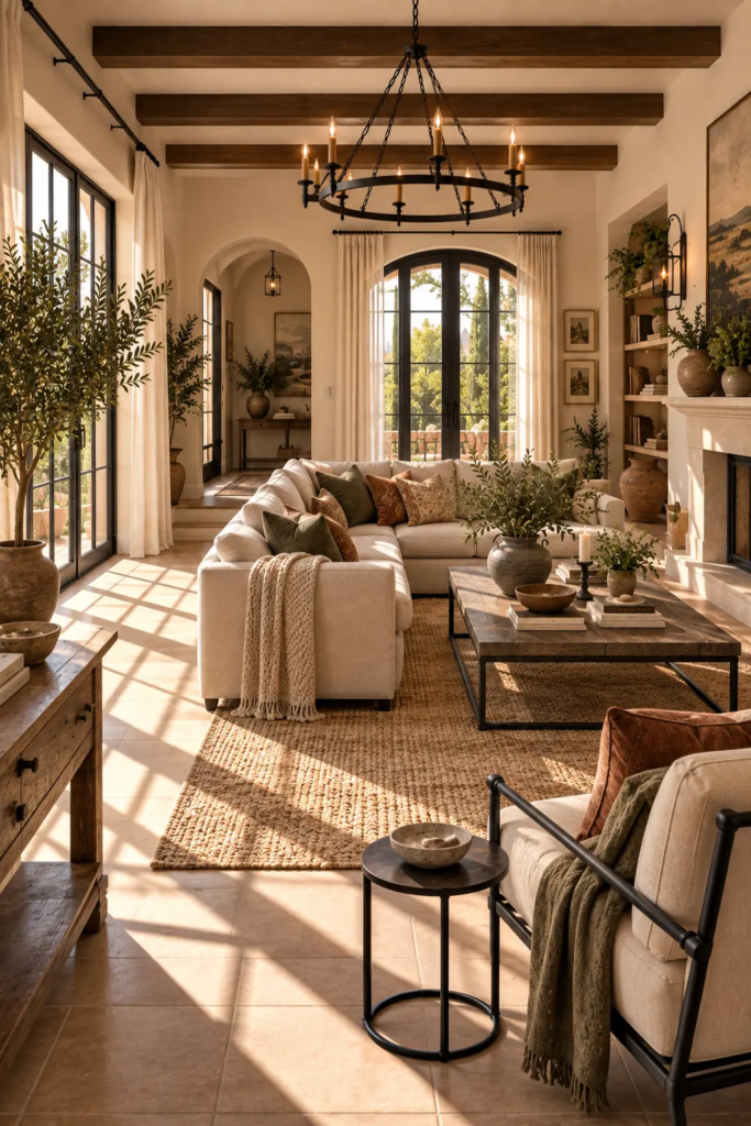
Spanish-influenced interiors are traditionally built around deep-set windows and courtyards that filter strong sun into soft, warm light. Without that architecture, sheer or loosely woven natural linen curtains hung close to the ceiling can approximate the effect, softening whatever light your room actually gets rather than blocking it. Avoid heavy blackout drapery in this style even in a bedroom-adjacent living space — the warmth depends on light moving through the room, not being shut out of it.
Curtain choices sized and styled for the room make a real difference here, since the wrong hardware or a too-narrow rod undercuts the soft, filtered-light effect the style is built around.
Common Mistakes to Avoid
Treating the style as “anything terracotta.” Terracotta color without the accompanying iron detailing and textural textiles reads as generic warm neutral, not Spanish-influenced — the material combination is what carries the identity, not one color alone.
Over-polishing the metal finishes. Bright brass or shiny chrome pulls the room toward a different (often more glam or coastal) direction. Matte, slightly textured iron is the detail that keeps the look grounded.
Skipping texture in favor of color alone. A room painted the right terracotta tone but furnished entirely in flat, smooth fabrics will look like a paint color choice, not a style — the hand-woven textiles are doing real work, not just decoration.
Going too dark across every surface. Deep, saturated color works as an accent — one wall, one rug, a few accessories — but applied everywhere at once, it can read heavy and closed-in rather than warm.
Budget-Friendly Ways to Get the Look
A full room refresh isn’t necessary to shift toward this style. Repainting a single accent wall in a warm ochre or terracotta tone is one of the cheapest, highest-impact changes available. Swapping brass or chrome hardware and light fixtures for a matte iron finish is a low-cost update that touches multiple areas of the room at once. A single well-chosen wool or jute rug, even a budget-tier one with visible chunky weave, does more for the look than a handful of smaller accent purchases spread thin.